Deeper Into The Weeds of TIC For Red, Blue, And Collateral – Alhambra Investments
Why are US banks borrowing hundreds of billions of US “dollars” (quotation marks fully deserved given the nature of these borrowings which are neither physical currency nor easily identifiable even on the global ledger, too many classified here as “other”) from themselves? Technically, for regulatory and accounting purposes “American” banks (a classification which includes domestic subsidiaries of foreign banks) are transferring massive sums from their own foreign offices (including those foreign parents) and creating huge interbank, inter-office liabilities in the process.
Confused yet? We’re just getting started.
As interesting as that above might be, and it is, at the same time they’re also – in the aggregate – lending fewer “dollars” (also a lot of “other”) especially to places like Tokyo and Emil Kalinowski’s palatial lair in the Caymans.
The TIC data is amazingly complex and therefore a useful puzzle to those wishing to solve the global reserve dilemma.
First, Treasury’s TIC update for the month of November 2021 starts off well enough. The overall net was a big positive on the month (+$102.9 billion) after having been negative three of the six prior dating back to May. Such volatility isn’t unusual, this back and forth a normal part of sorting the fluid situation out there in the offshore shadows.
After May’s big decline (-$40.6 billion), for example, TIC rebounded the very next month by a similarly-sized net gain (+$72.6 billion).
As we often find during said volatility, to some extent the net positive ying to the yang of those red flag minuses masks other difficulties further on. As has been the case in numerous instances since 2014, a big positive month of foreign net buying of US$ assets obscures the official net selling often accompanying it – just as it was in November 2021 (second below).
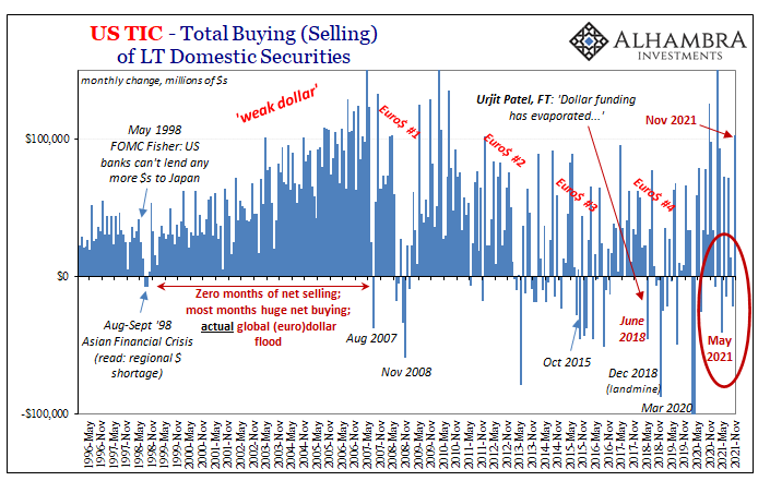
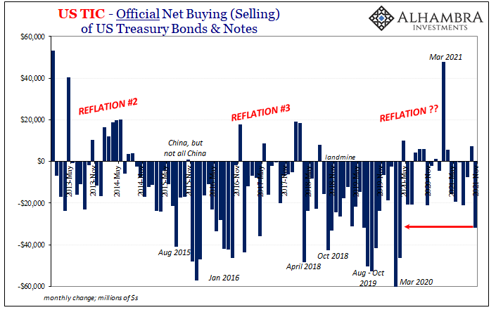
You have to wonder, given the repeated evidence, if the foreign appetite or ability to purchase more assets at least in the one month of November was substantially subsidized by the sizable use of “reserve” assets indicated by the official selling of USTs (and November was the largest such net negative since the last GFC crisis).
Without overseas official intervention, what does that month truly look like in the real world? November wasn’t a particularly positive one, if you recall.
That’s the other correlation which binds the data across its broad grasp; net foreign selling corresponding to what I wrote above, the second part lining up US bank lending (claims on) to foreign financial sectors.
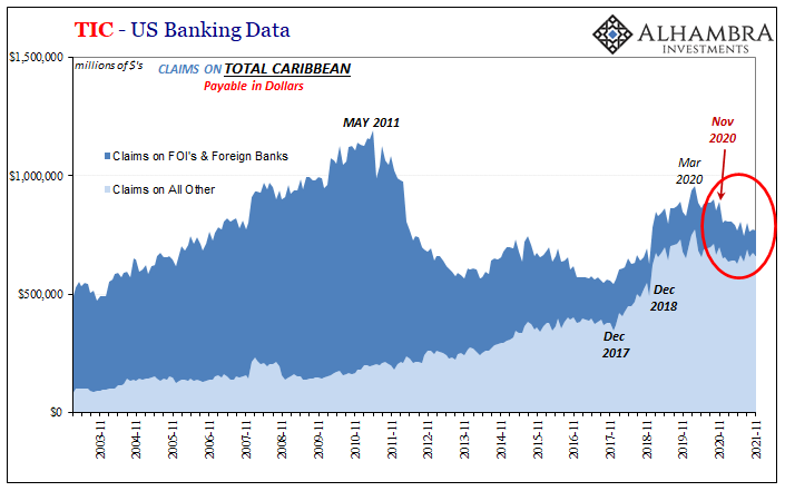
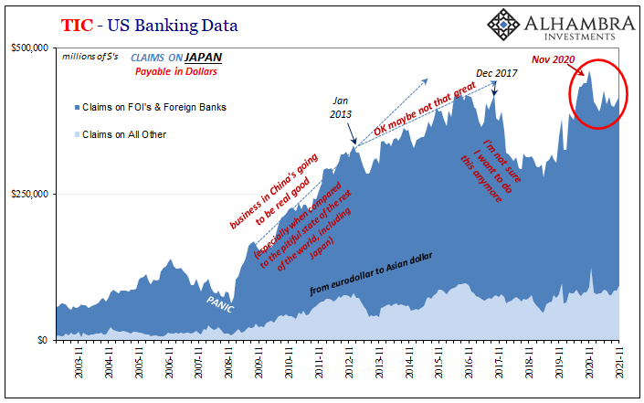
If you go back to the November 2020 in the TIC data, domestic banks starting in December 2020 haven’t kept to the same levels of activity with either their counterparts in the Caribbean or in Japan. These two crucial eurodollar redistribution (and money creation) nodes are responsible for much of the marginal funding conditions over the past few decades – including the interim period between 2009 and 2013 when Japan was forwarding some or all of these “dollars” into and around China.
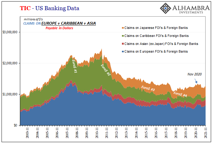
Since May 2011 when the Caribbean firms grew very cold feet even when planted on the hot sand beaches around Emil’s den, this has explained much about Xi Jinping’s global and domestic agenda as it related to wingless-tigers since proliferating all over emerging markets. Any hope for global recovery in the immediate aftermath of GFC1 died when these places decided to take that enormous step back in their dollar businesses you see below (the one immediately below is a partial combination of the two straight above).
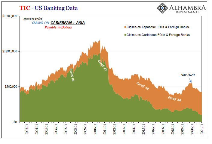
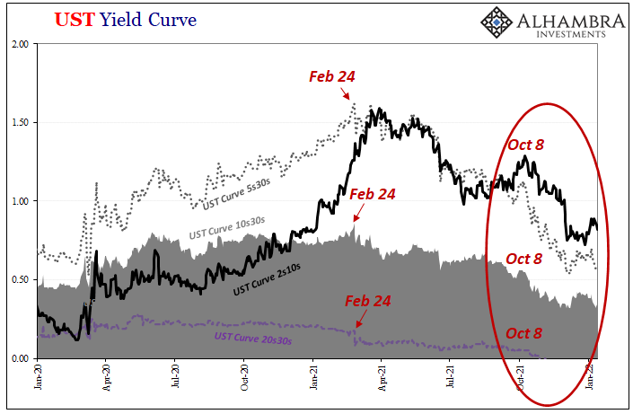
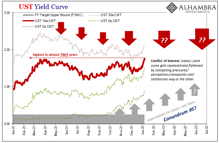
More recently, going back into December 2020, they’ve done so yet again which in its aftermath lines up with a bunch of different real-time market data; everything from the rising US$ exchange value (or the change in angle for CNY) to a few months later (with an assist from February 2021’s Fedwire disruption) the sharp change in the character and shape of the UST yield curve (from steepening and rising nominal rates to sideways yield-wise and serious flattening which continues even today).
This setback in two particular geographies from among specifically banking firms within them has been sizable enough that you notice it even when including all the rest of the categories; financial entities as well as other geographies. US banks have been lending more to Europe over the same timeframe, for instance, but not nearly enough to offset what they aren’t lending into the Caribbean or Tokyo.
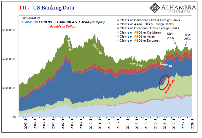
So that all makes, I think, pretty straightforward sense; US banks do less (meaning repo, derivatives, deposits, you name it) with the outside, overall, especially when it comes to those two key regions, the net result is a worldwide dollar deficit of some degree (and remember what we don’t see from TIC because we can’t: overseas to overseas eurodollar activity almost certainly affected by all this).
With that in mind, the amount of funding coming back into the US from outside has been fascinating. This goes back to the prior November, too, but mainly over the five months July to November 2021 (inclusive).
US banks have “borrowed” (liabilities to) an additional $624 billion from overseas. Who? What? A variety of things though concentrated importantly in a couple categories.
Starting with “what”, about $150 billion of that six hundred was deposits at foreign banks, a little more than that same amount was “other” borrowings, and then another hundred fifty or so some kind of negotiable securities, some of which were Tbills, about $60 billion “other” kinds of securities, and then a final $90 billion of more “other” (SMDH).
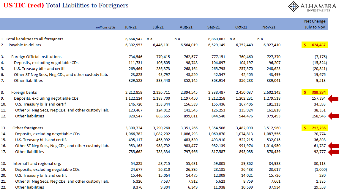
Insofar as from “who” these American institutions are borrowing whatever the hell these “dollars”, a huge chunk has come from…themselves. Not joking.
According to TIC’s memoranda, two-thirds (~$300 billion out of the identified $450 billion) of this large leap what’s been broken down in inbound activity originated as “liabilities to own foreign offices.”
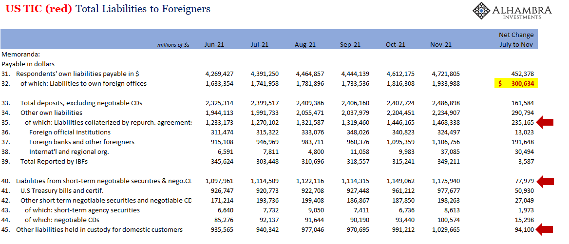
In terms of disclosed instruments, quite a lot related to – you knew this was coming – repo (liabilities collateralized by repurchase agreements) along with borrowing a bunch of Tbills (also from themselves) to go along with “liabilities held in custody for domestic customers.” One’s collateral, the second’s a step removed from directly stated as collateral, and the last smells, walks, and acts like collateral even if nowhere expressly stated as such.
Not only are these large numbers, they represent a serious change in the trends. One example:
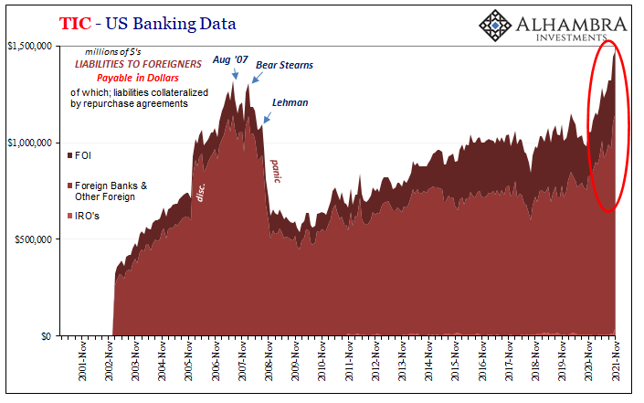
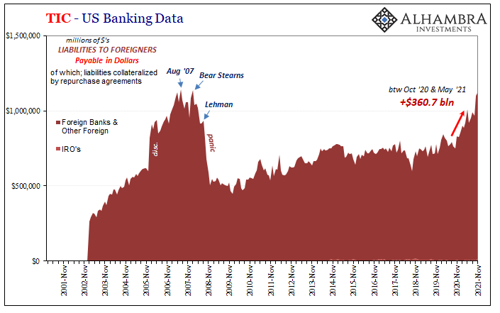
The amount “borrowed” from FOI’s is basically the foreign repo pool, which Emil and I had talked about before, central banks and governments around the world parking more liquid correspondent reserves with FRBNY (the first of the two charts above). But what about borrowings, in repo, from foreign banks and a lot of which is collateralized between offices of the same banking company?
To me, that hints at collateral in general which, for reasons that aren’t apparent in this data, scale up to the stuff we just went through in the blue. It also starts to line up with T-bill rates going back to around January when they suddenly plummeted.
Collateral squeeze overseas might have caused US banks to suddenly pull back lending to (claims on) Japan and the Caymans (while still going with Europe for who knows why; maybe extra bunds and OATS floating around more easily transformed?), and then to send collateral back out by way of foreign offices transferring in the securities (including a whole lot of “other”) in repo maybe derivatives while “borrowing” “cash” coming back.
This would make sense at least in this one angle given how collateral multipliers and securities lending overall have proven time and again to be more sensitive outside the US than inside where Treasury issues its best of the best of the best OTR stuff. Just how does collateral therefore funding capacity circulate globally?
In other words, we just might be seeing here both the scale as well as the consequences of last year’s troublesome bout of collateral scarcity!
There are tons of caveats to be applied first, only beginning with a whole bunch of other TIC data I can’t even begin to incorporate here. So, grain of salt, there’s a chance of selection bias in highlighting these specific pieces which do fit nicely (too nicely?) with the overall deflationary/tightness story.
But either way, it sure doesn’t refute the idea and the way it does work into it makes it compelling nonetheless even if it ends up well short of conclusive.
Those curves went flat (and inverted) for some reason even as the US CPI and PPI’s here and elsewhere went vertical. If you struggle thoughtfully into all these deep weeds, I believe you can find part of the answer for the divergence – just in time for Jay Powell’s growing conundrum.
[ad_2]
Source link

The First Bank To Forecast A US Recession Now Warns To “Prepare For A Hard Landing”

Dimon Says Ukraine War, China Relations Are His Top Concerns