The Structural Drivers of Investment Returns


John P. Hussman, Ph.D.
President, Hussman Investment Trust
August 2022
This is the longest period of practically uninterrupted rise in security prices in our history… The psychological illusion upon which it is based, though not essentially new, has been stronger and more widespread than has ever been the case in this country in the past. This illusion is summed up in the phrase ‘the new era.’ The phrase itself is not new. Every period of speculation rediscovers it… During every preceding period of stock speculation and subsequent collapse business conditions have been discussed in the same unrealistic fashion as in recent years. There has been the same widespread idea that in some miraculous way, endlessly elaborated but never actually defined, the fundamental conditions and requirements of progress and prosperity have changed, that old economic principles have been abrogated… that business profits are destined to grow faster and without limit, and that the expansion of credit can have no end.
– The Business Week, November 2, 1929
After more than 40 years of work in the financial markets, studying all the data I could get my hands on, I’ve found it to be universally true that those who argue “history doesn’t matter” have never actually studied history.
While the value-conscious, historically-informed, full-cycle discipline that emerged from that research helped to admirably navigate decades of market cycles prior to the Federal Reserve’s deranged foray into zero-interest rate policy, I’ll note right up front that the stupidest thing I’ve ever done was to rely on historical “limits” to stupidity. Easy money does nothing to support the market when investor psychology is risk-averse, as investors should recall from the 2000-2002 and 2007-2009 collapses, but it’s a remarkable amplifier of speculation if investors have psychologically ruled out the possibility of price losses – getting a yield greater than zero becomes the only thing that matters. Faced with zero interest rates, yield-seeking investors continued speculating past every historically-reliable “limit.”
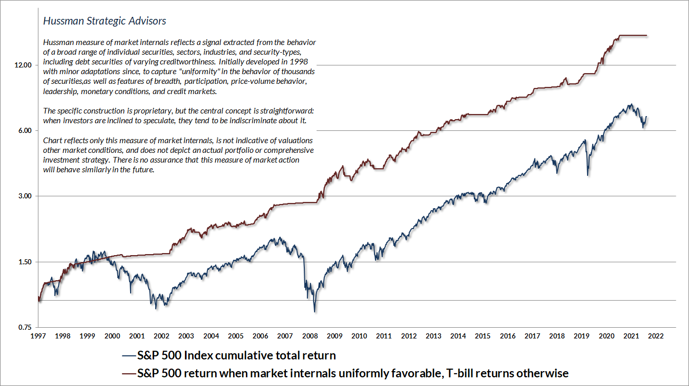
We’ve adapted in recent years, becoming content to align our outlook with prevailing market conditions – mainly valuations and market internals, which are our best gauge of speculative versus risk-averse investor psychology – without assuming “limits” to either. When investors are inclined to speculate, they tend to be indiscriminate about it. I constructed our gauge of market internals in 1998, with minor adaptations since, to measure the “uniformity” of market action across thousands of individual stocks, industries, sectors, and security-types, including debt securities of varying creditworthiness. Internals remain unfavorable here, valuations remain historically extreme, and interest rates are no longer at zero, but we’ll still defer our bearish outlook if uniform market internals indicate that investors have taken the speculative bit back in their teeth.
The chart below presents the cumulative total return of the S&P 500 in periods where our measures of market internals have been favorable, accruing Treasury bill interest otherwise. The chart is historical, does not represent any investment portfolio, does not reflect valuations or other features of our investment approach, and is not an assurance of future outcomes.
You’ll notice that the recent market advance has not been adequate, at least thus far, to shift our gauge of market internals to a favorable condition. That was also true during the 2000-2002 and 2007-2009 collapses. The role of market internals in our discipline is not to “catch” short-term market swings. Rather, our objective is to gauge speculation versus risk-aversion among investors. On average, our gauge of market internals shifts about twice a year, though about 25% of shifts persist for fewer than 6 weeks, and about 25% persist for 40 weeks or longer. We don’t attempt to forecast these shifts. We simply respond to them.
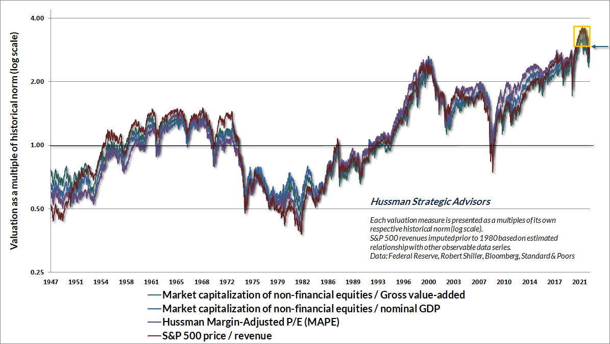
With regard to market valuations, the chart below shows several of the valuation measures that we find best-correlated with actual subsequent S&P 500 total returns in market cycles across history, each as a multiple of its respective historical norm. All of these measures stand at about 2.8 times the historical norms that we associate with run-of-the-mill long-term S&P 500 total returns of 10% annually. Indeed, following the rebound of recent weeks, all of these measures are above every level of market valuation observed prior to August 2020, including the 1929 and 2000 extremes. The little box in the upper right shows every instance in history when valuations have been higher than they are today. Investors relying on a “new bull market” here are relying on that little box to be the “new normal.”
Our main difficulty with quantitative easing and zero interest rate policies was that they encouraged speculation beyond every historically-reliable “limit.” Valuations and market internals remain essential elements of our discipline – we simply abandoned our reliance on those limits. That adaptation restores the flexibility that helped us to navigate decades of prior market cycles.
If our measures of market internals improve, we may not embrace the notion of a “new bull market,” which frankly seems insane to us, but we also won’t fight it with a persistently bearish market outlook. Indeed, as I’ve detailed in prior market comments, uniformly favorable internals can provide opportunities for what Benjamin Graham might describe as “rational speculation” even in an overvalued market. Amid current valuation extremes, that would most likely take the form of a modestly constructive outlook, coupled with position limits and safety nets. At lower valuations, a shift to favorable internals would encourage more aggressive market exposure. Presently, however, we observe unfavorable market internals in a hypervalued market that has fully cleared its previous oversold condition. Historically speaking, that’s a terribly negative combination.
How monetary easing amplifies speculative psychology
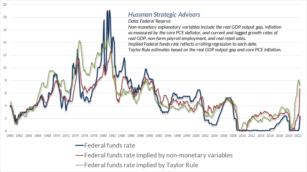
On the subject of Federal Reserve policy, the chart below is a visual lesson in how to drag your feet, abandon systematic policy, and in so doing, amplify the late-1970’s inflation, encourage a mortgage bubble that collapses in global financial crisis, provoke an “everything bubble” of yield-seeking speculation (with another collapse likely), and contribute to the highest rate of inflation in 40 years.
Wall Street appears convinced that the half-point retreat from the highest core inflation in 40 years, currently at 5.9%, will encourage the Fed to “pivot” to lower rates in no time. Yet when the Federal Funds rate has been lower than core inflation, with core inflation above even 2.5%, the Fed has never shifted to easing unless recession has pushed the unemployment rate toward 6% or higher. It’s also worth noting that the only bear market low in history that occurred in the midst of a Fed tightening cycle was in 1987, at an S&P 500 forward operating P/E of less than 10, and a price/revenue multiple less than a quarter of today’s level.
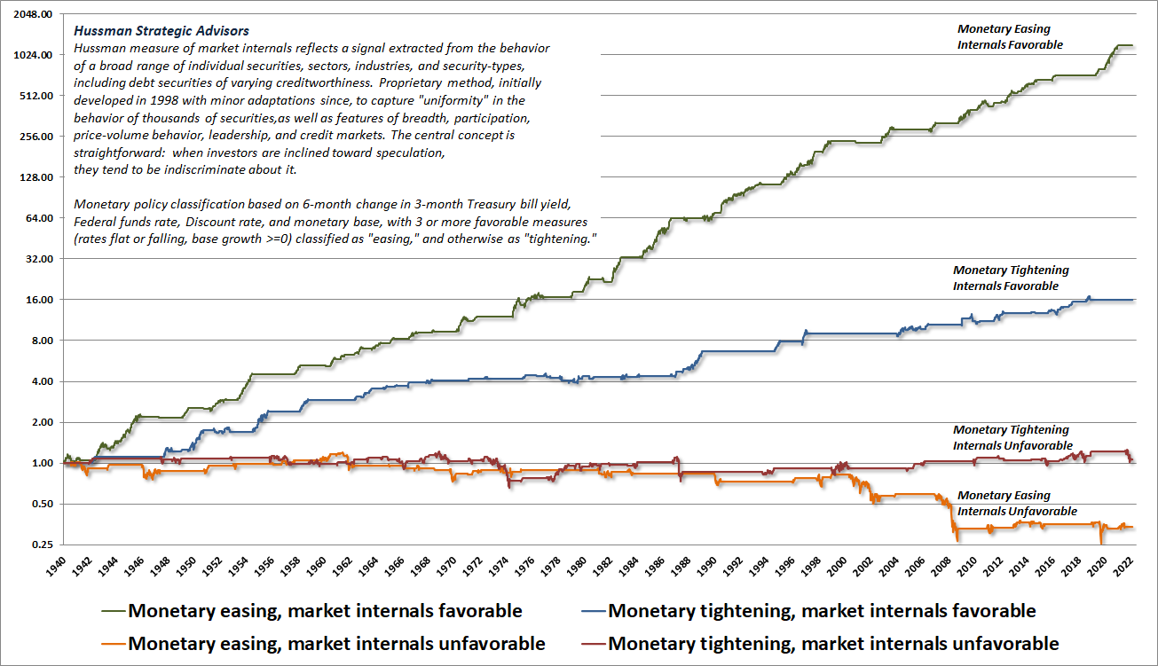
Despite the market’s recent enthusiasm about a slight easing of inflation, “Will the Fed pivot?” is the wrong question in the first place. What matters is for investor psychology to shift from risk aversion to speculation. That psychology is best inferred from the uniformity of market internals, and no forecasts are required. While Fed easing can amplify speculation when investors are inclined to speculate, it does nothing to support stocks when investors are risk-averse. That’s because when investors are risk-averse, they treat safe liquidity as a desirable asset rather than an inferior one.
Indeed, all of the cumulative gains of the S&P 500 across history, over and above Treasury-bill returns, have occurred during periods of favorable internals on our measures, regardless of whether Fed policy has been easy or tight. The worst combination of market conditions actually emerges when unfavorable internals are joined by a shift to Fed easing, particularly in an overvalued market. Easy money in a risk-averse market is an indicator of crisis and not much else. While easy money can encourage a shift toward speculation, it’s dangerous to rely on that, and much more beneficial to respond to internals directly.
Wall Street appears convinced that the half-point retreat from the highest core inflation in 40 years, currently at 5.9%, will encourage the Fed to “pivot” to lower rates in no time. Yet when the Federal Funds rate has been lower than core inflation, with core inflation above even 2.5%, the Fed has never shifted to easing unless recession has pushed the unemployment rate toward 6% or higher. It’s also worth noting that the only bear market low in history that occurred in the midst of a Fed tightening cycle was in 1987, at an S&P 500 forward operating P/E of less than 10, and a price/revenue multiple less than a quarter of today’s level.
One of the fascinating aspects of financial television is that when the market is above popular moving-averages and the Fed is easing, the only things you hear are “Don’t fight the trend” and “Don’t fight the Fed.” Yet the moment those factors turn unfavorable, everyone becomes all too happy to fight the prevailing trend and prevailing Fed policy, calling bottoms and new bull markets with every rally. Unfortunately, during extended declines like 2000-2002 and 2007-2009, that happens the entire way down. For our part, we’re content to align our outlook with prevailing, observable market conditions, and our outlook will change as those conditions change.
The new era
The ‘new era’ commencing in 1927 involved at bottom the abandonment of the analytical approach; and while emphasis was still seemingly placed on facts and figures, these were manipulated by a sort of pseudo-analysis to support the delusions of the period. The ‘new-era’ doctrine – that ‘good’ stocks (or ‘blue chips’) were sound investments regardless of how high the price paid for them – was at bottom only a means for rationalizing under the title of ‘investment’ the well-nigh universal capitulation to the gambling fever.
– Benjamin Graham & David L. Dodd, Security Analysis, 1934
Despite the extremes in historically reliable valuation measures, we can be certain of one thing: investors don’t care. They never do at market extremes. If they did, the financial markets could never reach extremes like 1929, 2000, and today in the first place.
The typical objections involve a wide range of verbal rhapsodies involving technology, innovation, structural change, productivity, entrepreneurship, and highly profitable monopolies – all that can be broadly summed up by the phrase “new era.” It’s as if investors imagine that today is the first time the economy has ever encountered technology, innovation, structural change, productivity, entrepreneurship, and highly profitable (yet ultimately temporary) monopolies.
The economic and financial history that we take for granted is replete with bubbles, collapses, inflation, deflation, expansion, recession, depression, world wars, and countless innovations that had profound economic impact – automobiles, commercial aviation, automation, television, pharmaceuticals, electronics, computers, biotechnology – not to mention Otto Frederick Rohwedder’s 1928 introduction of sliced bread. But hey, the iPhone 14 is coming out.
It’s been the rule, not the exception, for historically-reliable valuation measures to appear useless during a speculative bubble. If rich valuations alone were enough to stop speculation, it would be impossible to reach the breathtaking extremes that precede the collapse. In the face of zero interest rates, even broadly-defined and historically-reliable “limits” to speculation became ineffective. Our response has been to give far more priority to the condition of market internals. As Graham & Dodd noted of the 1929 peak, investors abandoned their attention to reliable valuation measures precisely because “the records of the past were proving an undependable guide to investment.” Then the market lost 89% of its value.
It’s been the rule, not the exception, for the largest 10 stocks in the market to comprise between 20-30% of market capitalization. For a century, bull markets have peaked amid public perception that these behemoths stood behind utterly impenetrable fortresses.
It’s been the rule, not the exception, for statutory tax rates to change over time. They’ve moved from near zero in the early 1900’s, to 40% during World War II, to 52% in the 1960’s, to 35% during the 2000’s, and recently to 21%. But here’s the thing – corporations don’t compete on the basis of pre-tax margins – which would allow them to pocket the tax reductions permanently. They compete on the basis of after-tax margins, leaving after-tax profit margins far less sensitive to changes in statutory rates than investors seem to imagine.
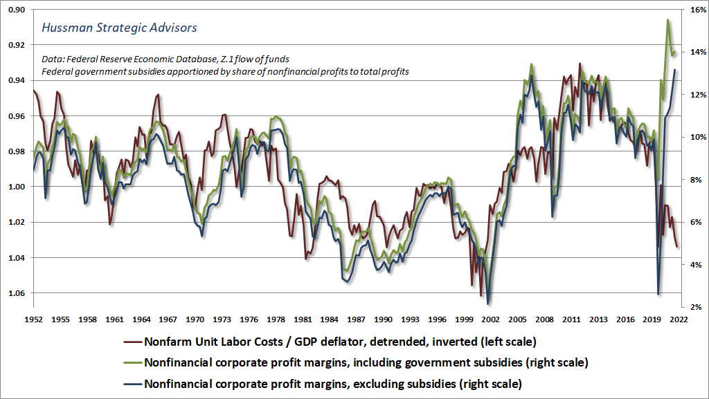
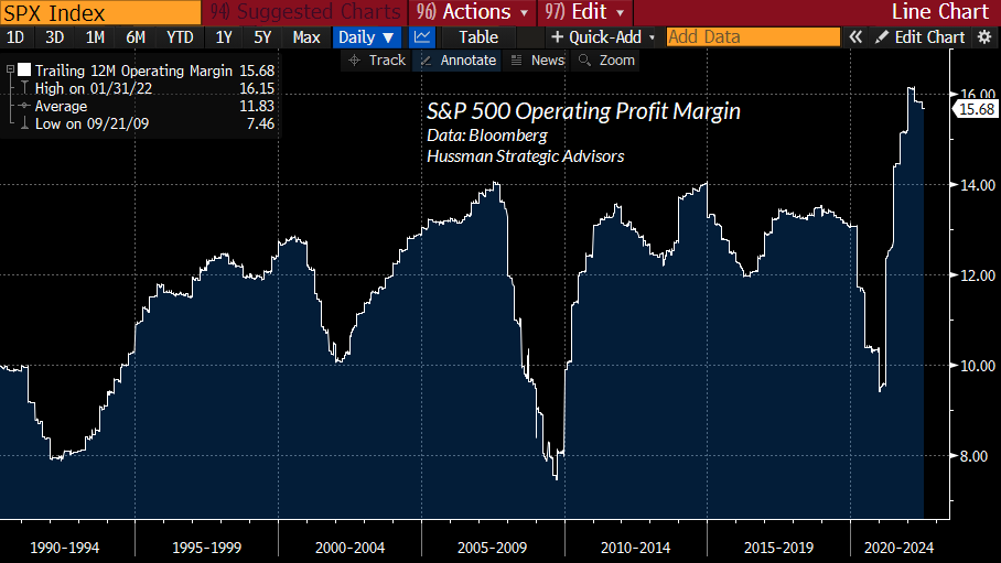
It’s been the rule, not the exception, for earnings to appear glorious at market peaks, encouraging investors to pay top dollar on top dollar. Yet despite the spike in corporate profits near economic peaks, longer-term profit margins have remained tightly linked to unit labor costs over time. During the “jobless recovery” that followed the global financial crisis, unit labor costs were very depressed, resulting in a surge in nonfinancial corporate profit margins. We’re starting to see that reverse, as real unit labor costs surge. In 2005-2007, corporate profits briefly bucked labor costs funded by a spike in home equity loans (household dissaving). This time, it’s been pandemic subsidies (government dissaving), first directly through payroll subsidies, then indirectly as consumers have spent down their own subsidies. My impression is that profit margins will not buck labor costs much longer.
It’s true that the recklessness of Federal Reserve policy has vastly exceeded the entire range of historical precedent in recent years (hence my preference for the word “deranged”), but as I’ve detailed previously, the main impact of these policies was to provoke yield-seeking speculation beyond previously reliable “limits.” Our own adaptation was to abandon our bearish response to those “limits.” Zero-interest rate policy clearly amplifies speculation, which requires us to place more weight on the tools we use to gauge speculative investor psychology, but that isn’t enough to constitute a “new era.”
It’s been the rule, not the exception, for low interest rates to encourage rich valuations. The problem is that low rates do nothing to mitigate the poor market returns that follow those rich valuations. It’s also worth noting that these policies had little measurable impact on output or employment. Indeed, despite the wild departures of Fed policy variables in recent years, information about monetary variables does very little to explain fluctuations in output or employment in recent decades, beyond what can be explained using wholly non-monetary variables.
So yes, zero-interest rate policy has been unprecedented, but its main impact has been on yield-seeking investor psychology, resulting in a greater need to rely on market internals. What zero interest rate policy doesn’t change is the arithmetic that links valuations and subsequent returns.
Because verbal arguments and anecdotes are easier than research, it’s common to claim that the extreme valuation of the market here is owed to a handful of large capitalization stocks. That’s just not the case at all. The chart below – thanks go to our resident math guru Russell Jackson for compiling the data – shows the median price/revenue across S&P 500 components over time. The current level is twice where it was at the 2000 market peak.
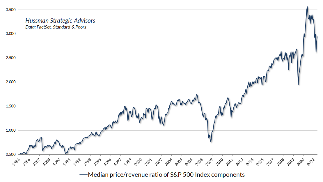
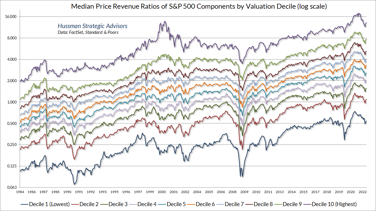
The reason the median price/revenue multiple of S&P 500 components is higher than at the 2000 peak (which is also true of the median price/earnings multiple) is that the tech bubble was a rather concentrated speculative episode. About half of individual stocks were reasonably valued, by our estimates, even at the 2000 market peak. In contrast, the recent zero-interest rate episode encouraged yield-seeking speculation across the entire equity market, leaving current valuations higher than at the 2000 bubble peak for every subset of stocks except the most richly valued 10%.
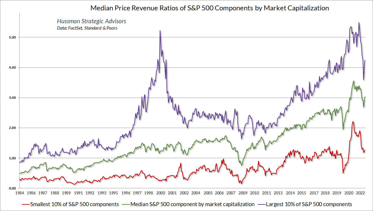
The same is true if we partition stocks by market capitalization. The median S&P 500 component, by market cap, is at a far higher price/revenue multiple than at the 2000 peak, as are the smallest 10% of S&P components. Only the stocks with the highest 10% of market capitalizations have lower price/revenue multiples than at the 2000 peak. I would argue that the current set of high multiple stocks are more deserving of their multiples than they were in 2000. But then, back in 2000 I projected (correctly) that technology stocks stood to lose about -82% of their value. I don’t expect market losses of that magnitude over the completion of this cycle.
Still, if investors can’t imagine the median price/revenue multiple dropping from its recent peak 3.6 to a trough of less than 1.5, when the long-term norm is actually below 1.0, the completion of the current market cycle may bring a fair amount of distress.
What is a “normal” P/E ratio?
Given the number of moving parts that drive profit margins for individual companies and the S&P 500 index as a whole, it’s difficult to rule out the possibility that profit margins in the future might average even 20-30% higher than historical norms. That’s the estimate one obtains by fitting a long-term uptrend to S&P 500 profit margins in post-war data. In my view, there’s nothing wrong with allowing for that, which would implicitly raise our estimates of “historically normal” valuations by that same 20-30%. But unless margins pump all the way to 2.8 times historical norms, and remain there forever, one can’t blurt out “profit margins” to explain away the level of market valuations here.
What’s odd is how adamant investors seem to be not only that profit margins will remain above average, but that they will not retreat even from current extremes. Have investors looked at where margins are here? They’re not just higher than the historical norm – they’re higher than at every point in history prior to the past two years. Yet Wall Street analysts describe P/E ratios as “cheap” and “reasonable” without a moment’s hesitation about the denominator.
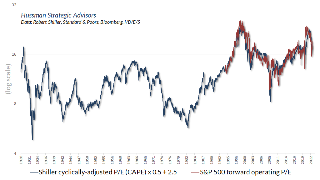
For investors who insist on using earnings-based valuation measures, the most frequently cited measure is the price/earnings ratio of the S&P 500, based on analyst estimates of year-ahead (“forward”) operating earnings.
Notably, “operating earnings” – sometimes called “earnings without the bad stuff” – only came into common use in the 1980’s. As a result, “historical” data for operating earnings can be an apples-to-oranges splice. As Bill Hester observed years ago, “The Bloomberg data series is a mixture: from 1954 through 1998, it’s a reported (GAAP) earnings series, which then morphs into an operating earnings series. The splice in the data creates a subtle but important problem. Operating earnings are persistently above reported earnings (by an average of about 30 percent). So when you splice an operating earnings series onto a reported earnings series, more recent levels of valuation look more attractive relative to history.”
Analyst estimates of year-ahead (forward) operating earnings have the benefit of smoothing out year-to-year fluctuations, but they can also be affected by pessimism or optimism among Wall Street analysts who provide these estimates. I sometimes suspect that part of the reason the forward P/E is so popular is that the historical data for it is so limited. So, what’s the actual historical “norm” for the forward operating P/E that’s so frequently quoted by Wall Street analysts?
Well, based on 30 years of forward earnings estimates from Wall Street analysts, it’s straightforward to show that the forward operating P/E has a very high correlation of about 0.92 with the Shiller cyclically-adjusted P/E (CAPE). When we estimate the relationship between the two, the best fit for the S&P 500 forward operating P/E is 2.5 + 0.5 x CAPE. The reason the forward operating P/E is so much lower than the CAPE is that the CAPE is based on a 10-year average of trailing GAAP earnings, while the forward P/E is based on analyst forecasts of next year’s operating earnings. Still, the linear relationship between the two is fairly tight. Using that relationship, we can impute the forward operating P/E all the way back to 1900. The norm is 11. Eleven. Not a typo.
Keep in mind that forward earnings give full credit to current record profit margins, and the Shiller CAPE gives full credit to the above-average profit margins of the past 10 years. For investors who are willing to believe that elevated profit margins will be sustained forever, these are the most optimistic valuation measures they can choose. Even then, to imagine that the current forward P/E of 19 is “normal” is to have no idea what “normal” means.
The structural drivers of investment returns
What drives investment returns? Can you simply buy stocks at any price and assume you’ll enjoy long-term returns on the order of 10% annually over the long-term? The answer is no. Unfortunately, the financial industry often encourages investors to imagine this is how markets work. Is there some meaningful structure that drives returns? The answer is yes. Understanding it offers clear insights about how we got here, and where we may be going.
Though our most reliable market valuation measures have a correlation of over 0.9 with subsequent 10-12 year S&P 500 total returns, understanding the structure of returns does not mean that returns are entirely predictable. Moreover, the shorter the investment horizon, the more influence psychological factors have on changes in valuations and market returns. Still, when the resulting returns are substantially higher or lower than you expected, it’s possible to identify exactly why that happened. That, in turn, typically has important implications for the market returns that are likely to follow.
If the slightest bit of arithmetic gives you hives, just skim over it, read the text, and take time to think about the underlying concepts. The charts that follow will provide a visual, long-term historical record to underscore the key points.
Let’s use “P” to mean the price of the S&P 500. We’ll use “F” to mean some fundamental that we expect over the long-term to be fairly representative and roughly proportional to the cash flows that S&P 500 companies will throw off to investors over time. You can choose earnings, revenues, or whatever you like. Some choices are better than others, but “smooth” and “fairly representative of long-term corporate cash flows” are by far the most important considerations. We’ll define a valuation ratio “V” as the ratio of P to F. We’ll use “D” to mean S&P 500 dividends.
Simple enough.
Notice that since the valuation ratio V is just P/F, we know that if V is held constant, prices must grow at the same rate as the fundamental F. If the valuation V increases over time, prices must grow faster than fundamentals. If the valuation V decreases over time, prices must grow slower than fundamentals, or possibly even decline. That’s true for any F you choose – it makes absolutely no difference – it’s always true. Investors will also earn a dividend on their investment, with a yield equal to D/P.
Simple enough.
For any limited holding period of T years, we now have three things, and only three things, that contribute to the annual total return of the S&P 500:
- The annual growth rate of fundamentals;
- The annualized change in the valuation ratio V over the holding period T;
- Annual dividend income
As I detailed in Making Friends with Bears Through Math, the arithmetic here comes down to:
Average annual total return = (1+g) x (V_future / V_today)^(1/T) – 1 + average dividend yield
Where g is the growth rate of fundamentals, V_future is the valuation multiple at the end of the T-year holding period (for a 10-12 year horizon, the historical norm tends to be a reasonable choice), and V_today is the current valuation multiple (current price / current fundamental).
All of this is true for any fundamental F you choose. The question of what makes one fundamental better than another comes down to a) how representative that fundamental is of the very, very long-term cash flows that stocks will throw off to investors over time –that’s what makes a valuation multiple meaningful and well-behaved, and b) how smooth and predictable its long-term growth rate is.
Based on the correlation of various valuation measures with actual subsequent S&P 500 total returns over a century of market cycles, we find that S&P 500 revenues and corporate gross value-added are the most reliable choices, nominal GDP is surprisingly good, while cyclically-adjusted (Shiller) earnings and forward operating earnings are useful, though not ideal.
Again, the smoother the fundamental is, and the more representative it is of very long-term cash flows – not just this year’s income – the more reliable it tends to be. In contrast, raw trailing earnings are awful, because cyclical fluctuations in earnings make the raw P/E volatile, noisy, and poorly-behaved – like I was in high school – a joke that doesn’t work because you probably suspect I was an obedient geek as a teenager – and you would be correct.
The chart below shows several reasonable choices for a “representative” fundamental, and one quite unreliable one. Reported earnings are actually more volatile than the S&P 500 itself. As I noted during the tech bubble, earnings tend to surge during economic expansions, making P/E ratios look “cheap” based on the temporarily bloated denominator. Likewise, earnings typically collapse during recessions, making P/E ratios look “expensive” at exactly the time stocks are most attractive based on long-term cash flows.
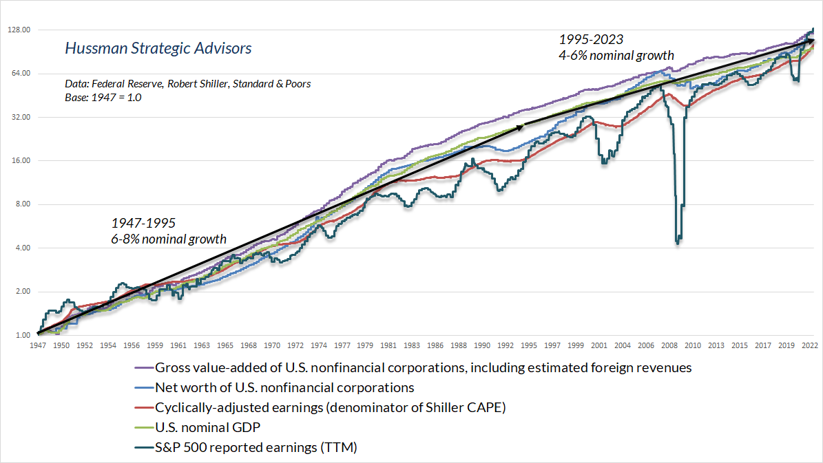
Notice that all of these underlying fundamentals have slowed to annual growth rates between 4% and at best 6% over the past 10, 20, and 30 years. That’s problematic, because the growth rate of fundamentals is one of the three structural drivers of total returns.
The gradual slowing in economic growth rates is enormously relevant to the question of whether current market valuations can be “justified” by low interest rates. Suppose that a stock is expected to deliver a given stream of long-term cash flows. Well, it’s generally true that lower interest rates would “justify” a higher price for that stock, because paying a higher price for a given stream of future cash flows will result in a lower long-term return. In this situation, the higher price is doing the job of lowering the long-term return on stocks, to a level that’s aligned with the lower interest rate on bonds.
Now consider a situation where interest rates are lower, but the growth rate of cash flows is also lower. In this case, no “valuation premium” is needed to align equity market returns with interest rates, because the low growth rate has already done the job. That’s roughly the situation we have today.
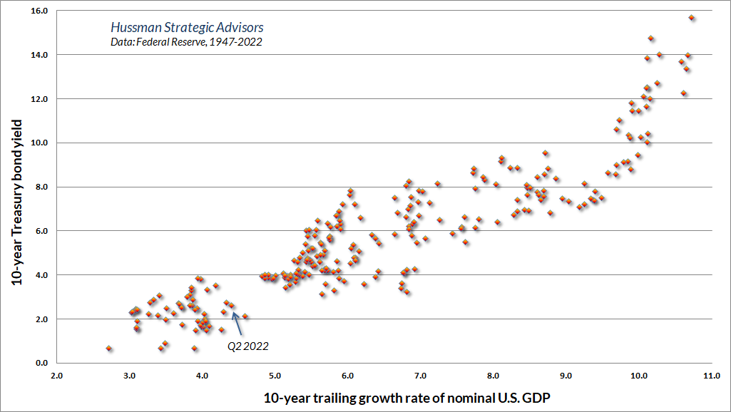
Put simply, when interest rates are low, but growth rates are also low, no valuation premium is “justified” at all. Even with the benefit of stock repurchases, S&P 500 revenues have grown at just 4% annually for the past 10, 20 and 30 years – about the same rate as nominal GDP. Yet based on the measures we find best-correlated with actual subsequent S&P 500 total returns, current market valuations stand at 2.8 times their historical norms, while the dividend yield of the S&P 500 is just 1.6%. That’s a real problem, because now you’ve got every component of long-term returns working against you.
It’s just arithmetic that if fundamentals grow at 4% annually, and the valuation ratio moves from 2.8 to even 1.5 times historical norms over a 10-year period, and dividends kick in 1.6% annually, the total return of the S&P 500 over that 10-year period would be:
(1.04)*(1.5/2.8)^(1/10) – 1 + 0.016 = -0.7% annually
There are only two assumptions here: the same growth rate for fundamentals as we’ve observed in the past three decades, and a terminal valuation of 1.5 times historical norms to allow for permanently above-average valuations and profit margins. The rest is just arithmetic.
Why has the rate of GDP growth and other reliable fundamentals slowed so persistently over the past several decades? The main reason is a progressive decline in what I’ve often described as “structural” economic growth. Structural growth is the underlying long-term rate of GDP growth, excluding the impact of cyclical fluctuations in the unemployment rate. The basic arithmetic here is:
Output = (Output/Employed workers) x (Employed workers/Labor force) x (Labor force)
Output growth = productivity growth + employment rate growth + labor force growth
What I call “structural growth” captures demographic labor force growth, plus trend productivity. “Cyclical growth” captures changes in the rate of employment vs unemployment. The structural growth rate of the U.S. economy is currently down to about 1.6% annually. Long-term growth in corporate revenues, earnings, and other fundamentals tends to mirror this structural growth. Nominal growth includes inflation, but be careful about your assumptions. Nominal S&P 500 earnings growth did not materially exceed 8.5% during the 1970’s, despite record inflation. Likewise, even with the benefit of share repurchases and a move to record profit margins, S&P 500 per-share earnings have grown at only 5.5% annually over the past decade. Maintaining profit margins at current record highs would still bring the future growth rate of earnings to the same, lower rate as revenue growth.
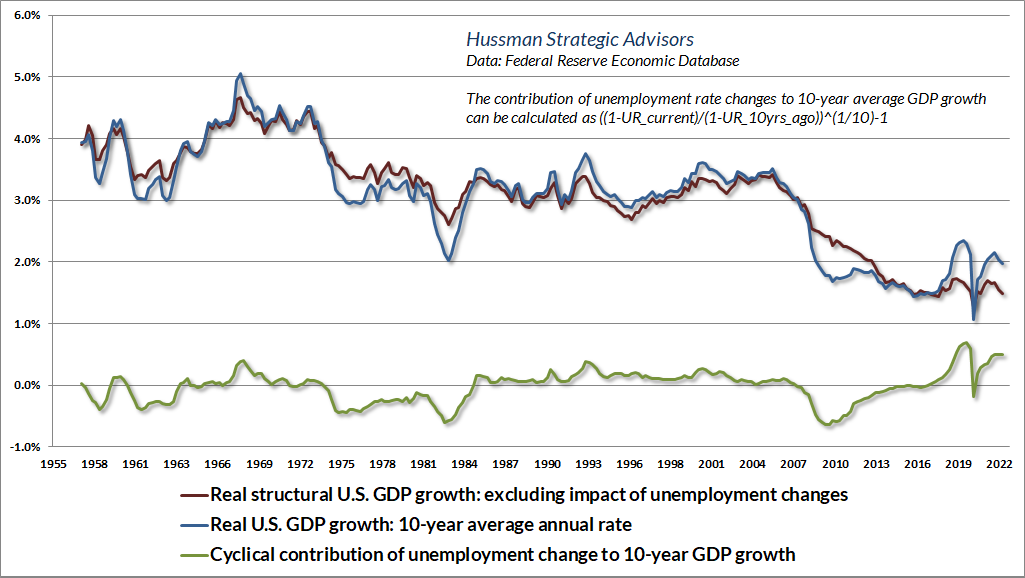
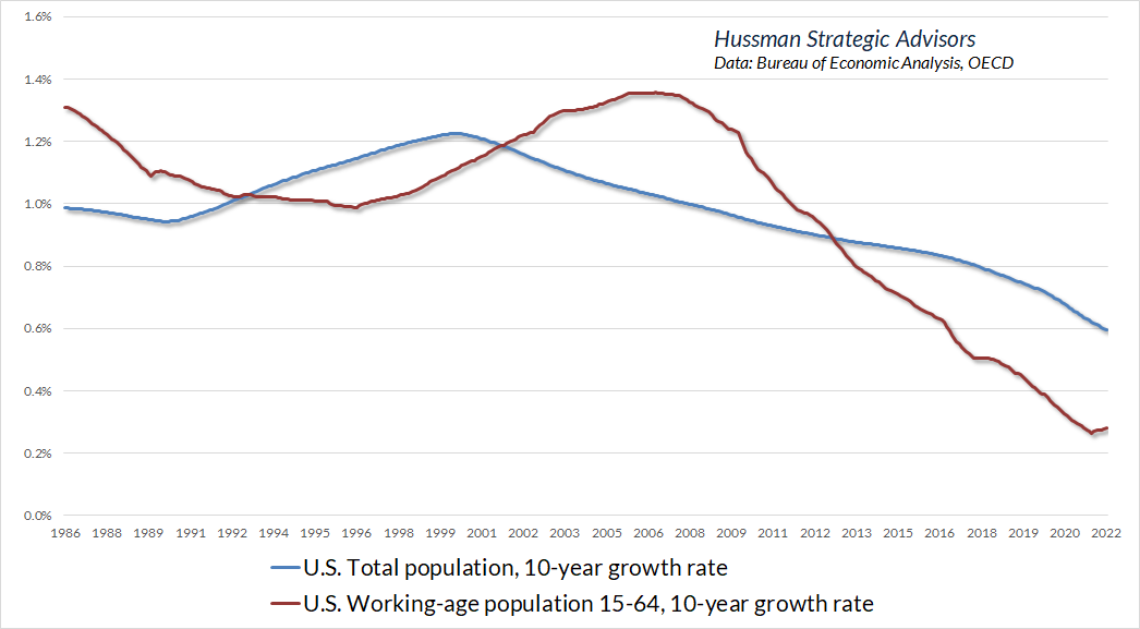
The declining rate of U.S. structural growth reflects a progressive slowing in trend productivity driven by decades of weak net domestic investment as a share of GDP, coupled with progressive slowing in U.S. population growth, amplified by a demographic shift as aging baby boomers exit the labor force. By 2030, the entire cohort of baby boomers will have reached 65, and while the labor force participation rate is still about 25% among older individuals, the slow growth of the labor force has clearly impacted structural growth. Combine slowing population growth, an aging labor force, and reluctant re-entry of workers following the recent pandemic, and the results also include a tight labor market, rising wage costs, and emerging pressure on profit margins.
In a nutshell, long-term investment returns are driven by precisely three factors: long-term growth in fundamentals (which have well-defined structural drivers), the annualized change in valuation multiples, and the dividend yield. If the growth rate of fundamentals is held constant, lower interest rates can “justify” higher valuations and lower dividend yields, in order to reduce the expected return on stocks to a level that’s commensurate with the low level of interest rates. Once valuations are elevated, however, low interest rates do nothing to mitigate the low stock market returns that follow.
Worse, if interest rates are low because growth rates are also low, no valuation premium on stocks is “justified” at all, because the low growth rate has already done the job of lowering the expected return on stocks. In this situation, elevated valuations and low dividend yields simply reduce the expected return on stocks even further.
You may not like this part
The charts below illustrate the dismal outlook for total returns that the Federal Reserve has encouraged by a decade of zero-interest rate policy and resulting yield-seeking speculation by investors.
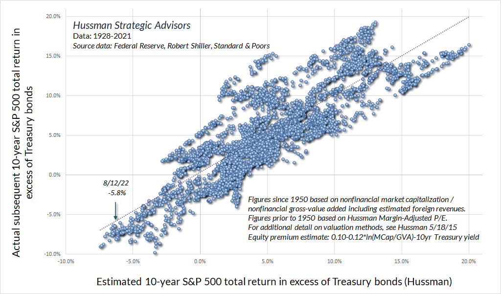
The scatterplot below shows the relationship between our most reliable valuation measure – nonfinancial market capitalization to corporate gross value-added – in nearly a century of data. From the current extreme, we expect the S&P 500 to lose an average of about -2.9% annually over the coming 12-year period. That’s somewhat worse than the losses that we (correctly) projected for the S&P 500 at the 2000 market peak, but then, the most reliable valuation measures are also more extreme than they were at that time.
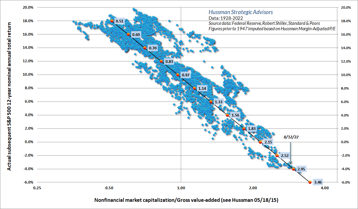
A key feature of the bubble period since 1995 is that average valuations have been substantially above their long-term historical norms. That observation makes it tempting to assume that valuations have simply “shifted” higher. As Graham and Dodd described this temptation in 1932, “the conclusion to be drawn was not that the stock was now too high but merely that the standard of value had been raised. Instead of judging the market price by established standards of value, the new era based its standards of value upon the market price.”
As an olive branch to this “new era” argument, the chart below separates the preceding scatterplot into two clusters – 1928 to 1995, and 1995 to the present. You’ll notice that the more recent light green cluster is higher, suggesting that for any given level of valuations, subsequent 12-year S&P 500 total returns have averaged 1-4% higher than the pre-bubble period. The more recent cloud is associated with run-of-the-mill 10% expected returns at a valuation level of about 1.2 times the valuation that was previously associated with that return, suggesting that the “new normal” for valuations is about 1.2 times the previous norm. It’s not 2.8 times historical norms, which is where we are at present, but it’s a start.
Next, I’ll tell you why I don’t even trust that conclusion.
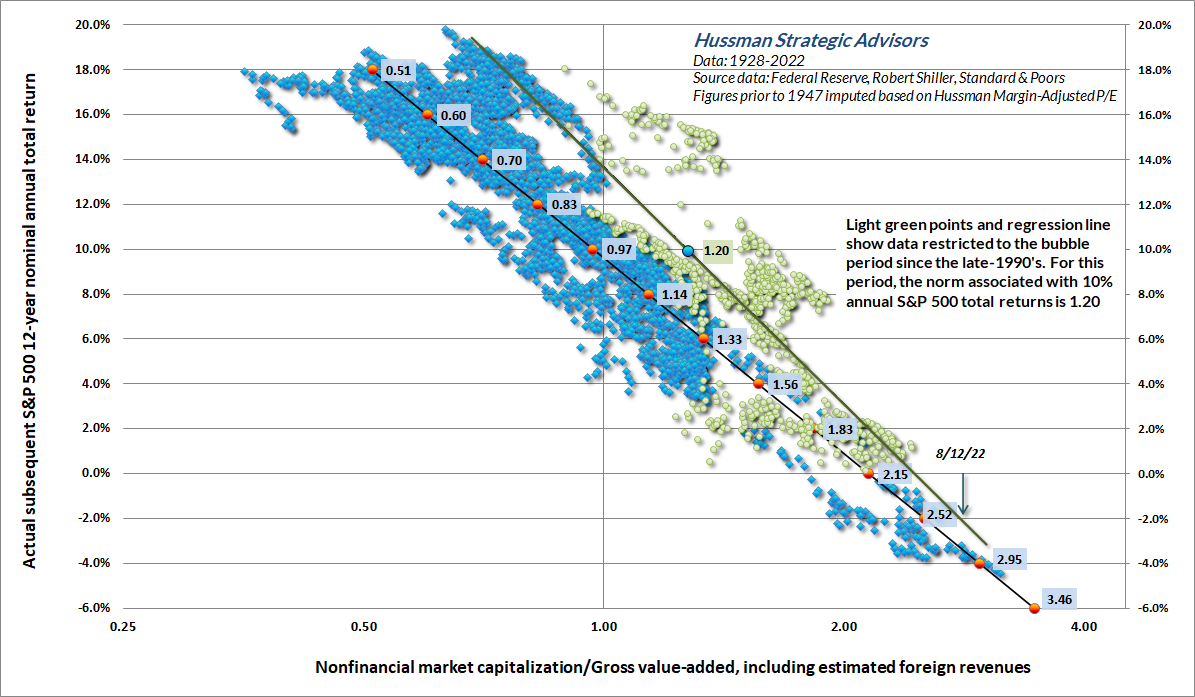
A key feature of the chart above is that the slope of the relationship between valuations and returns since 1995 is steeper than the historical relationship. Measured from low valuations, subsequent returns have been substantially higher than during the pre-bubble period, but measured from rich valuations, subsequent returns have not been much different from what investors could expect in the pre-bubble period. That pattern actually a “tell.” It’s not the relationship between valuations and returns that has shifted up in parallel. Rather, it reflects a sequence of bubbles since 1995 that front-load returns, and then resolve with negative returns, as usual.
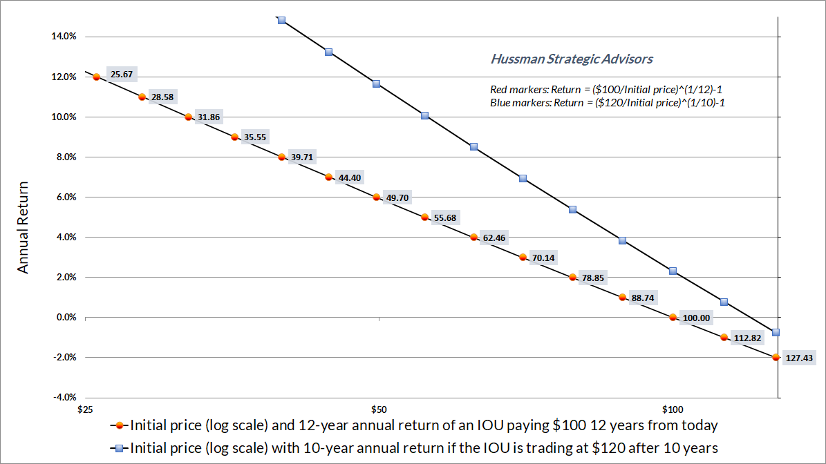
To see what’s going on, consider our typical example of a security that will deliver a $100 cash flow say, 12 years from today. The line with red dots in the chart below shows the relationship between the initial price (log scale) of that IOU and its subsequent return. As usual, we see a nice linear relationship between initial (log) valuations and subsequent returns. While it’s a 12-year IOU, the annual return on the horizontal axis in this example is also the average return we expect in years 1, 2, and 3 all the way out to 10, 11, and 12.
Now suppose that for whatever reason, speculators have actually driven the price of this IOU to $120 after the first 10 years. The combination of a higher valuation at the 10-year mark, coupled with the fact that those returns have been front-loaded over a shorter period, results in the steeper relationship, shown on the line with blue squares. The problem is that the blue line doesn’t capture the subsequent losses that are baked into that $120 price. If it did, the blue line would collapse to the red one. Put simply, the apparent “shift” in the relationship between valuations and returns is an artifact of front-loaded returns and speculative overpricing.
Investors seem unanimous in expecting stocks to at least outperform the low yield on Treasury bonds in the coming years. Unfortunately, based on measures that are well-correlated with subsequent market returns (aside from periods ending at bubble peaks), we estimate that S&P 500 returns are likely to fall short of bonds just as badly as they did from the 2000 and 1929 peaks.
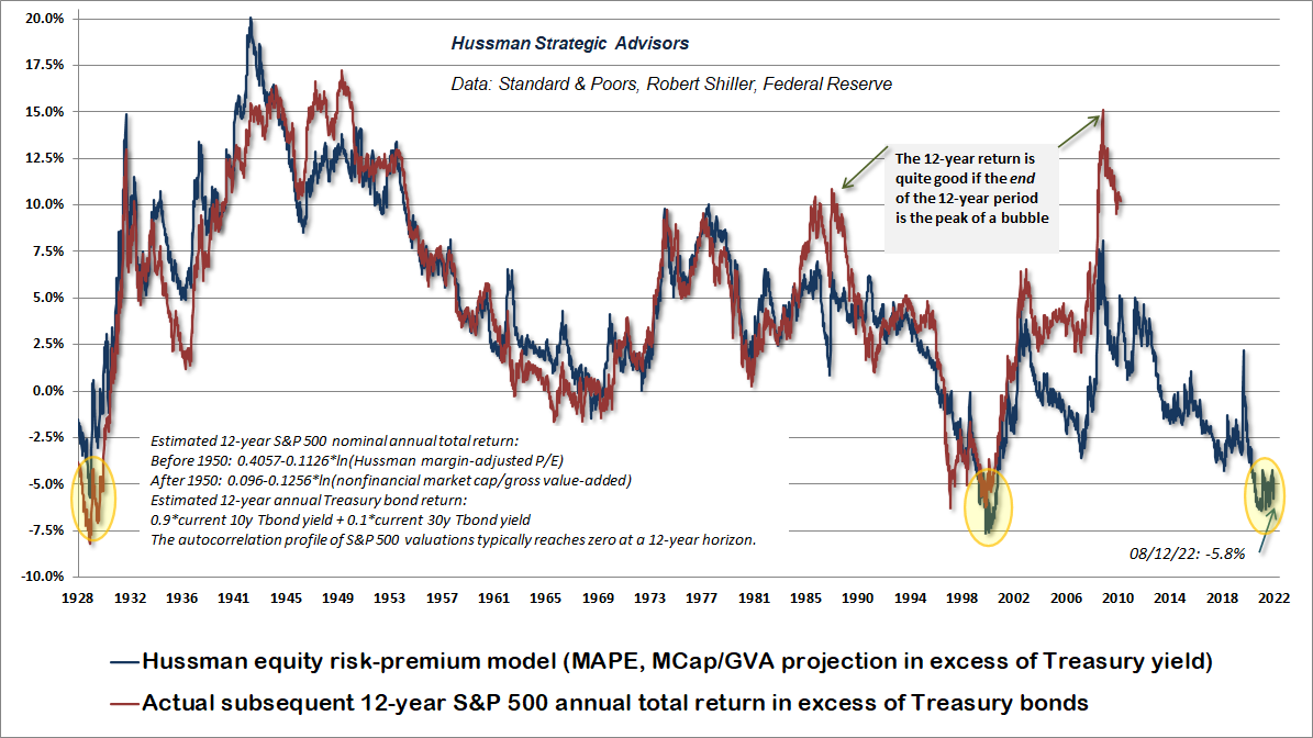
While Wall Street analysts often attach the phrase “equity risk premium” to the difference between the S&P 500 forward operating earnings yield (the inverse of the operating P/E) and the 10-year bond yield, that estimate of the ERP is a rather weak predictor of the actual subsequent return of the S&P 500 in excess of bond yields. The December 2020 comment provides a detailed analysis of the “excess CAPE yield” proposed by Shiller, Black and Jirav, which is somewhat better than using the forward operating yield, but not by much. The chart below shows the relationship between our own equity risk premium estimate, compared with actual realized returns of the S&P 500 over bonds, in data since 1928.
Further details relating to MarketCap/GVA (the ratio of nonfinancial market capitalization to gross-value added, including estimated foreign revenues) and our Margin-Adjusted P/E (MAPE) can be found in the Market Comment Archive under the Knowledge Center tab of this website. MarketCap/GVA: Hussman 05/18/15. MAPE: Hussman 05/05/14, Hussman 09/04/17.
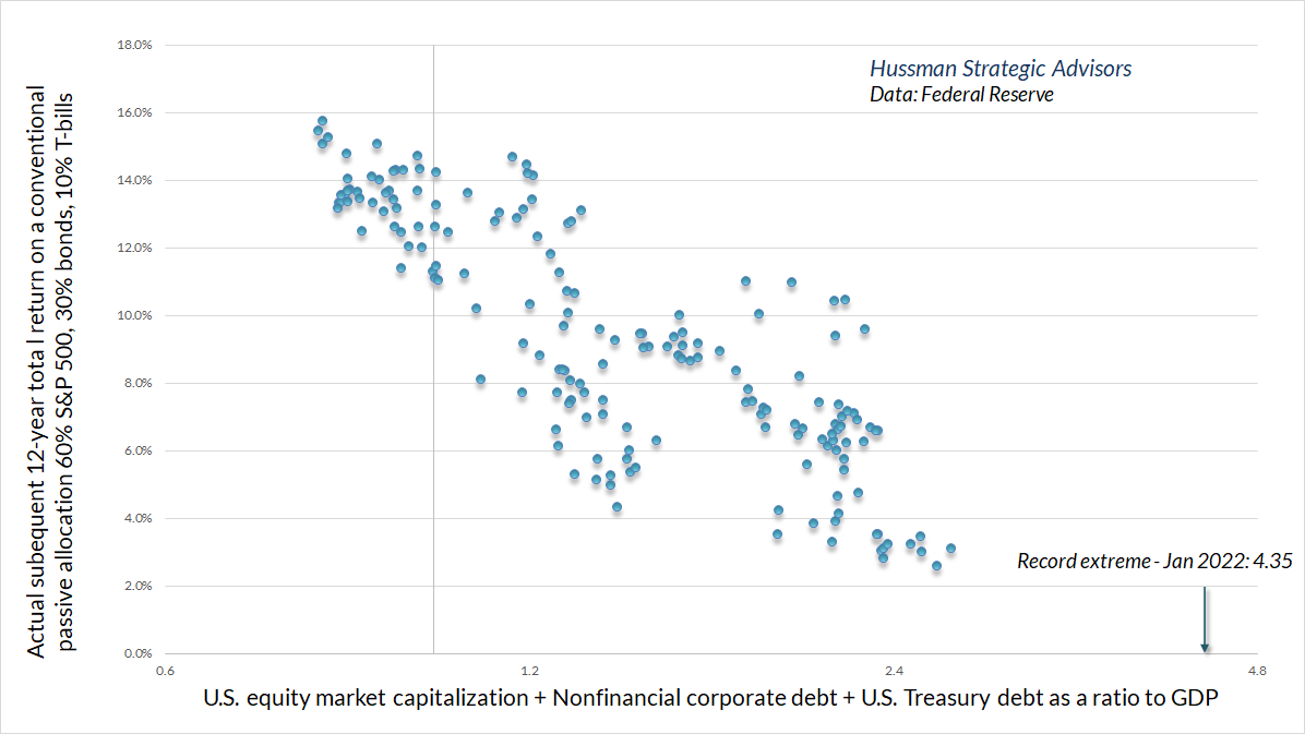
The present combination of rich equity market valuations and low interest rates doesn’t create a “justified” or “fair” situation for the financial markets. It simply combines insult with injury – creating a poor outlook for returns across the entire investment portfolio. There’s no question that higher interest rates, coupled with a retreat in stock market valuations, has improved the outlook for the returns of a passive investment portfolio. Unfortunately, this improvement is relative to the most extreme valuations in history. As a result, we currently expect a slightly negative average annual 12-year total return for a conventional passive investment allocation holding 60% in the S&P 500, 30% in Treasury bonds, and 10% in Treasury bills.
As Bloomberg’s Mackenzie Hawkins observed last month, “When pensions miss their assumed annual return targets — about 7% on average — states and local governments have to increase funding or cut costs by raising employee contributions or freezing cost-of-living increases.” Given that our projections are nowhere near 7% annually, it’s fair to say that we expect widespread pension strains in the coming years.
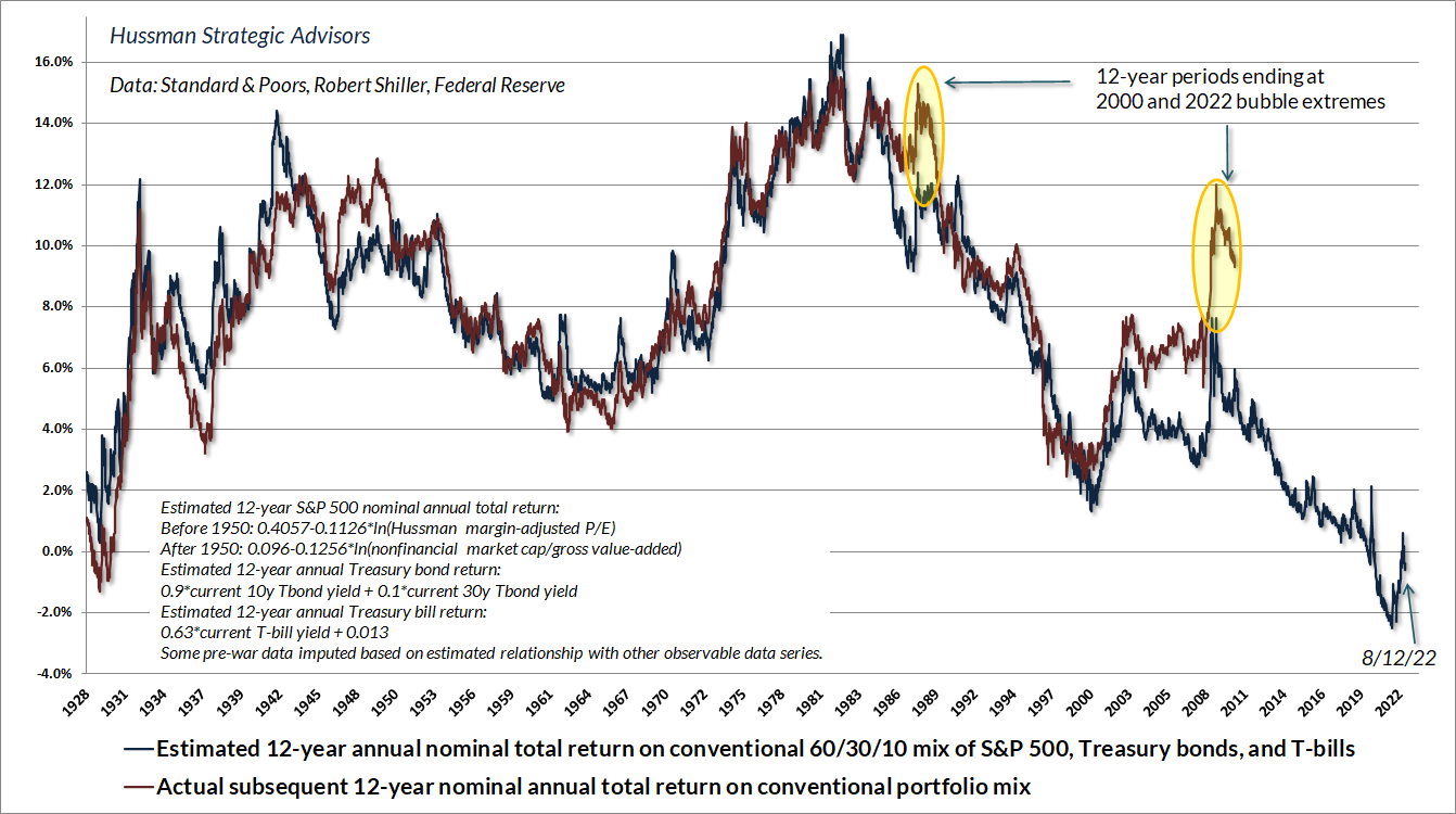
Notice the “outliers” highlighted in yellow. If one examines the components that drove those returns (growth in fundamentals, dividend yield, change in valuation), we know precisely what caused those outliers: record valuations at the endpoint of each of those 12-year investment horizon. While investment returns over the past 12 years have been glorious, it is essential for investors to understand that they cannot be extrapolated. To the contrary, when past returns have been driven by a move to record valuations, subsequent returns are generally marked by a steep retreat in those valuations. Following the market peak in 2000, investors experienced this retreat as more than a decade of negative S&P 500 total returns (though relatively high Treasury bond returns provided some relief). From current extremes, we expect the combination of extreme equity valuations and depressed bond yields to produce more than a decade of negative total returns even for a 60/30/10 portfolio.
Still, keep in mind that a negative 10-12 year outlook can shift to a more favorable one even within a year or two, if the market experiences a material retreat in valuations (as it did from 2000-2002 and 2007-2009). It’s just the current long-term return prospects that investors may want to reconsider.
The bottom line is simple. Long-term investment returns are not independent of the means to generate them. As I emphasized last month, “The cash flows generated by the economy are nowhere near enough to service bloated market capitalizations in a way that provides adequate long-term investment returns.”
As usual, no forecasts are required. We certainly have long-term and full-cycle market views, driven by valuations, but we’ve abandoned our belief in speculative “limits,” which in turn restores our flexibility in response to shifts in market conditions, particularly those that help to distinguish periods of speculation versus risk-aversion. With that, we’re content to align our outlook with observable market conditions as they change.
That leaves us with a perspective that may seem odd. We are willing to take strong stances, both defensive and aggressive, with regard to market risk. Yet except when the market is strenuously overbought in a negative Climate, or deeply oversold in a positive one, we rarely have any forecast at all about the market outlook even a few days or weeks out. Our current defensiveness (fully hedged) is not a forecast of market action, but an identification of the prevailing Climate at this moment. To ask “Where do you think the market is going?” is to invite frustration. It’s like asking Columbus whether he thinks the trees at the edge of the earth are maples or pines. We just don’t look at the world that way. Now, my long-term view is a different story, because ultimately, the long-term return on stocks is tightly linked to valuations. What is relevant, from our discipline, is that the current Climate is the most negative one we identify. That might change next week, or it might not change for a year. There is no need to forecast when the next shift will occur. For now, we remain strongly defensive.
– John P. Hussman, March 24, 2002
As it happened, even though stocks had been in a bear market for nearly two years, the S&P 500 would lose another third of its value by October 2002, while the Nasdaq 100 would lose another 45%.
The foregoing comments represent the general investment analysis and economic views of the Advisor, and are provided solely for the purpose of information, instruction and discourse.
Prospectuses for the Hussman Strategic Growth Fund, the Hussman Strategic Total Return Fund, the Hussman Strategic International Fund, and the Hussman Strategic Allocation Fund, as well as Fund reports and other information, are available by clicking “The Funds” menu button from any page of this website.
Estimates of prospective return and risk for equities, bonds, and other financial markets are forward-looking statements based the analysis and reasonable beliefs of Hussman Strategic Advisors. They are not a guarantee of future performance, and are not indicative of the prospective returns of any of the Hussman Funds. Actual returns may differ substantially from the estimates provided. Estimates of prospective long-term returns for the S&P 500 reflect our standard valuation methodology, focusing on the relationship between current market prices and earnings, dividends and other fundamentals, adjusted for variability over the economic cycle.
[ad_2]
Source link

Gold is ready to rise

Gimme EXPENSIVE Shelter (Under Biden)! Owners Equivalent Rent Rose 8.1% YoY, Highest In History (25 Straight Months Of NEGATIVE Real Weekly Earnings Growth YoY) – Confounded Interest – Anthony B. Sanders