Unrounded MoM CPI: 0.65% – Price Increases Are Widespread
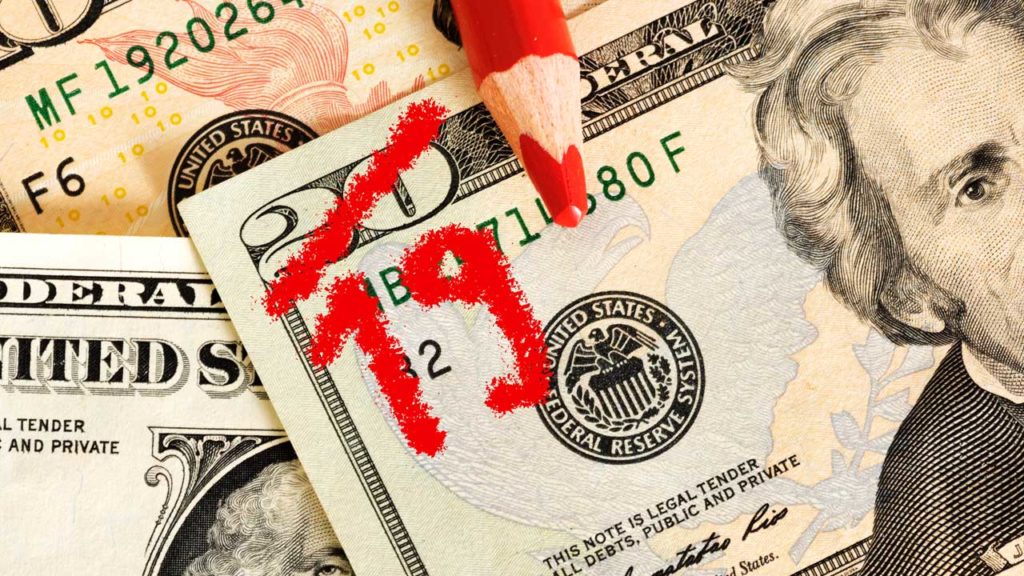
The latest seasonally adjusted inflation rate for January was 0.65% month over month, with a non-seasonally adjusted annual rate of 7.48%. Both of these numbers came in above expectations.
As hypothesized last month, it was very possible that Omicron temporarily restrained inflation in December and a rebound should be expected. It did not take long for the rebound to occur!
As shown in the chart below, Covid cases blasted higher starting in late December and into January. Cases have since come back down quite significantly. It’s very possible that February CPI comes in even higher than January as restrictions are loosened and activity picks back up.
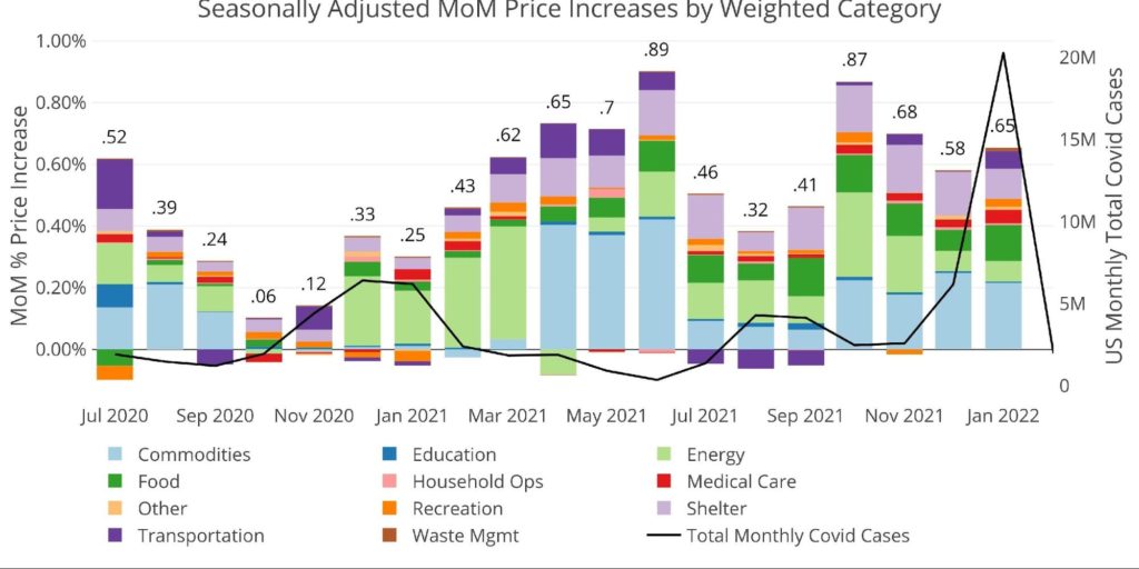
Figure: 1 Month Over Month Inflation
As shown above, higher cases have tended to slow inflation, and when cases head back down, inflation picks back up (presumable as the economy opens back up and spending increases). It should be noted that the impact of cases on inflation is weakening: inflation is getting higher even in the face of high cases. February and March could provide great insight into how inflation tracks for the rest of the year.
Previous dips of inflation over the last 18 months can be attributed to rising Covid cases. With Omicron fading, the economy opening up, and Spring ahead, what will inflation do? Will the Fed finally be right? Will getting people back to work help ease supply constraints? Or, will an opening economy actually exacerbate the inflation problem?
The chart below shows YoY inflation and nothing about it looks like it will turn around soon. Every category continues to get larger!
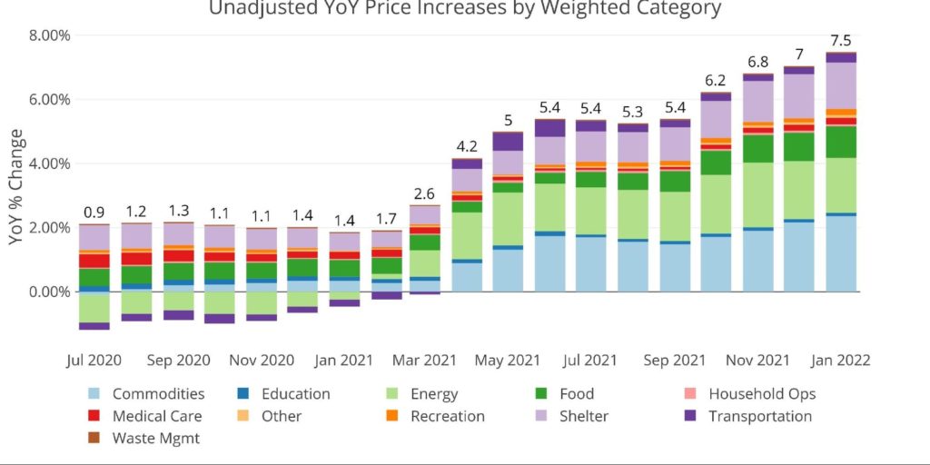
Figure: 2 Year Over Year Inflation
The chart below compares the most recent numbers with the year-over-year monthly average. Eight of eleven categories are currently sitting above their 12-month averages. Only Education, Energy, and the highly doctored Shelter figure are below the TTM average.
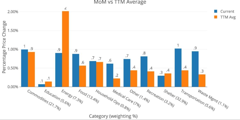
Figure: 3 MoM vs TTM
The table below gives a more detailed breakdown of the numbers. It shows the actual figures reported by the BLS side by side with the recalculated and unrounded numbers. The weighted column shows the contribution each value makes to the aggregated number. Details can be found on the BLS Website.
Note: Household Operations has not been reported for two months in a row. It was calculated below by starting with Services and backing out the other categories.
Some key takeaways:
- According to the BLS, Shelter is up 4.38% YoY, but actual market rates are above 12% YoY
- The BLS is understating increases in housing by 8%!
- Food rose by almost 1% in a single month!
- Meats “only” rose by 0.3%, but Bakery products & Fruits/Veggies were both up 0.9%, Dairy was up 1.1%, while Other was up 1.7%.
- Food away from home was up 0.7%
- Keep in mind, these are monthly increases!
- Commodities were up 1.0%. Rises were across the board in Household furnishings (+1.6%), Vehicles (0.9%), Apparel (1.1%), and Recreation (1%)
- Alcohol (0.4%) and Education (0.3%) were only moderately higher
- Transportation was also up 1% despite a -7% drop in Car Rentals.
- Public transport was up 1.6% with Airline fares up 2.3%!
The full report can be found at the BLS. These price increases are occurring across the entire economy. This is not an issue where one or two categories are driving prices. Everything is going up in price.
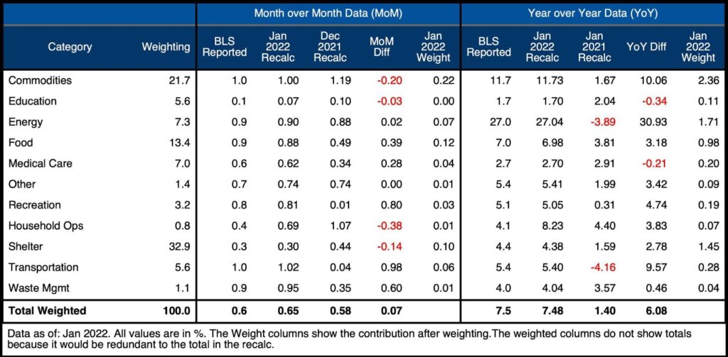
Figure: 4 Inflation Detail
Looking at the Fed Numbers
While the Fed does have different categories, their aggregate numbers match to the BLS.
Their data goes back to the 1950s. Unfortunately, they do not publish the weightings of each category so it would be impossible to do a similar analysis showing the impact of each category on the overall number.
Looking at history back to 1950 puts the current spike into perspective. The current spike is much larger than the one seen pre-2008 and more closely resembles the move in 1972 when prices went from 3% to 11% in under two years. That inflation proved “transitory”, falling back to 5% in 1976 before reaching 14.6% in 1980. If the correlation in the money supply matches that of the 60s and 70s, then inflation could just be getting started. Without Paul Volker around to bring prices back down, what is the Fed banking on?
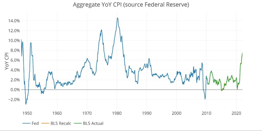
Figure: 5 Fed CPI
Using the Fed categorical data, which is different than the BLS, the next chart shows the current period versus TTM and trailing twenty years. As can be seen, only Education and Transportation are below the 12-month averages.
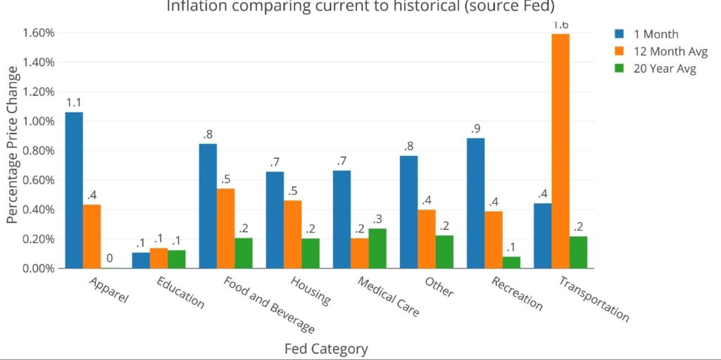
Figure: 6 Current vs History
Historical Perspective
Recalculating the BLS number is not a perfect science. The weightings must be scraped from the web pages. The index data is then gathered using an API. Each index comes seasonally adjusted and unadjusted. Regardless, putting the historical data together provides a good perspective on the current period.
The BLS weightings have only been scraped back to 2012, thus the chart below shows the past 10 years of annual inflation data, reported monthly. The volatility in Energy can be seen clearly over this time period.
Nothing about the chart below could make someone believe the problem will fix itself. Unclogging supply bottlenecks cannot bring the price of everything back down. Primarily because supply chain bottlenecks were caused by the massive increase in the money supply. The current trade deficit shows that this is clearly a demand problem and not a supply problem.
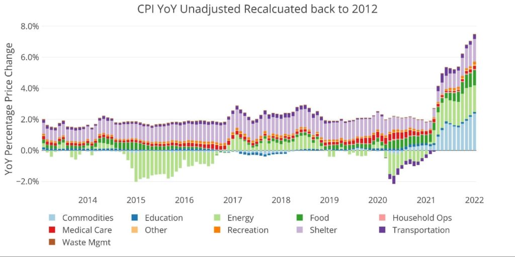
Figure: 7 Historical CPI
What it means for Gold and Silver
Gold is actually up after the CPI data despite an initial sell-off. Gold has quietly climbed back above $1830 which has proved tough resistance over the last year and is now testing $1840. This is despite the 10-year rising above 2%! As Peter Schiff recently said on his latest podcast, the Fed has admitted they can’t do much about inflation. They are still hoping inflation mostly recedes by itself. Given the data, this seems highly improbable! Perhaps the market is finally waking up to this fact.
The market has clearly already priced in an “aggressive” Fed. Unless the Fed starts telegraphing more aggressive hikes, gold may have found a floor with plenty of upsides ahead. The four 0.25% hikes expected in 2022 will do nothing to slow inflation. More than likely, the Fed will not even get all four hikes in before they find a reason to “wait and see”.
Regardless of the short-term movement, the dollar is rapidly losing purchasing power. With real inflation much higher than 7.5%, it’s only a matter of time before the dollar comes under pressure. This will create a massive tailwind for gold and silver.
Data Source: https://www.bls.gov/cpi/ and https://fred.stlouisfed.org/series/CPIAUCSL
Data Updated: Monthly within first 10 business days
Last Updated: Jan 2022
Interactive charts and graphs can always be found on the Exploring Finance dashboard: https://exploringfinance.shinyapps.io/USDebt/

Call 1-888-GOLD-160 and speak with a Precious Metals Specialist today!
[ad_2]
Source link
Ray Dalio says UK’s economic plan suggests incompetence

Summer Worker Shortage Means Things Will Be Closed. Again.