November 2022 Newsletter: The Long-Term Fiscal Spiral
November 20, 2022

Latest Article:
This newsletter continues with the theme that I discussed in my prior (October) newsletter, by examining the long-term fiscal issues of the United States and what that can mean for currency fundamentals.
Political Incentives and Debt Accumulation
Modern fiat economies run on Keynesian economic theory- specifically the idea that a sovereign government and its central bank should act as a counter-cyclical force on the private sector to smooth it out.
In this framework, if the economy is performing very strongly, the government can run a fiscal surplus, which sucks some money out of the economy and can be used to build a reserve for weaker times. During recessions, the government can deploy those reserves and run fiscal deficits, or issue extra debt to run fiscal deficits (if they don’t have much reserves), and those deficits inject some money into the economy at a time of weakness and illiquidity, and serve as a stimulus.
In practice, what happens instead is that the government almost always runs a deficit, during both strong economic times and recessions, with the difference being that the deficits tend to be even larger during recessions. In other words, rather than a dial between cold and hot as they theoretically should have in this framework, the government instead has a dial between warm and hot.
The ability to perform this function is enhanced when a country has the ability to print its own currency with no cost, and when its liabilities are denominated in its own currency, which is the case for modern developed market economies. This makes it so that a country has no realistic default risk, and instead merely has currency dilution risk.
This trend is due to political incentives. Most governments around the world run persistent fiscal deficits, because politicians are incentivized to focus on making the public happy over a 2-5 year period, not a multi-decade period. Cutting spending and/or raising taxes to run a fiscal surplus is pretty unpopular to do unless the economy is exceptionally strong. Politicians that try fiscal austerity tend to not remain in power long, and so it’s a self-selecting process towards more spending and/or less taxation, and thus larger deficits.
This chart looks at annual fiscal deficits over a very long timeframe, which puts the historical scale and inflation into perspective:

This chart, more helpfully, shows deficits as a ratio to GDP:

During the late 1990s and early 2000s, the US experienced a rare fiscal surplus. This was partially due to actual attempts at austerity- during the Clinton Administration taxes were raised and some of the ongoing growth in expenses was trimmed. And it was partially due to huge stock gains during the run-up to the Dotcom bubble.
However, it was even more-so a matter of demographics. The surplus coincided with the all-time peak in US labor force participation:

This chart is a bit noisy so we can break it down a bit. Labor force participation rose sharply from the 1960s through the 1990s for two main reasons: the large Baby Boomer generation entered working age years, and it became more culturally normal for women to work full time alongside men, and so female labor force participation rose substantially until it found a new plateau of cultural normalcy.
Starting in the mid-1960s and continuing through the mid-1970s, the US expanded social programs and became involved in the Vietnam War, and so deficits rose despite higher labor force participation. Other than that period, deficits and labor force participation were rather inversely correlated. After labor force participation peaked and rolled over by the 2000s, the structural surplus turned into a deficit, which of course was also exacerbated by the wars in Afghanistan and Iraq.
Many people look back at the 1990s in the US as basically being the cultural and economic peak, and the data do support that. Labor force participation and consumer sentiment both reached their all-time peaks. The US began running a fiscal surplus. There was relative peace in terms of US armed conflicts between the end of the Gulf War and the terrorist attacks of 9/11.
With peak demographics behind the country, the Global Financial Crisis of 2008 ushered in the next wave higher for debt relative to GDP:

To zoom out really far, I’ll point to my #1 chart that I’ve been referencing for over two years now (which admittedly needs some updating, but still gets the point across):

There are many similarities between the current period and the 1940s, which was the only other time in US history where debts reached this high relative to the size of the economy. There are many differences too, of course, which I’ve catalogued in other articles.
Why “Debt Doomsayer” Calls Were Premature
From the post-WWII period until the early 1980s, federal debt mostly went up in nominal terms, but went up more slowly than GDP. The late 1960s and the entirety of the 1970s were rather inflationary, and so some of the prior debt’s value was inflated away. By the end of the 1970s, bonds were sarcastically referred to as “certificates of confiscation” because they lost so much purchasing power over a very long period of time. Debt as a percentage of GDP bottomed at around 30% in the early 1980s.
This trend shifted significantly in the 1980s, where debt began structurally rising faster than GDP. Fed Chairman Paul Volcker jacked up interest to very high levels to reduce demand and quell inflation, and try to to maintain the value of the dollar in the eyes of foreign creditors. Globalization began to occur, with the gradual economic opening of China, followed by the fall of the Soviet Union, the signing of the North American Free Trade Agreement, and then the inclusion of China into the World Trade Organization. This was a structurally disinflationary period, where pools of excess Western capital and pools of excess Eastern labor were united in globalization. Interest rates were much higher than inflation, and there was a significant amount of military spending tied to the Cold War in the 1980s.
In the late 1980s, this combination led a number of fiscal hawks to become concerned about the debt. The first “National Debt Clock” was installed in New York City in 1989 to highlight the problem to the American public. It began with around $2.7 trillion in debt, and the numbers began ticking ever-upward. Following that, presidential candidate Ross Perot in the early 1990s was concerned about the fact that federal debt had risen from 30% of GDP to 50% of GDP, and so he made fiscal austerity a significant part of his campaign platform. He was the most successful third-party US presidential candidate in modern history, with nearly 19% of the popular vote.
Those debt numbers almost seem quaint now, and the timing of the message was early. The peak demographics of the 1990s and 2000s, along with structurally lower interest rates, resulted in the debt-to-GDP ratio holding sideways at under 65% from the early 1990s all the way until the Global Financial Crisis in 2008. Even after that, it took additional years for the federal debt to start to really matter.
This ended up being the reality for those late-1980s and early-1990s fiscal hawks:

If we look at federal interest expense, it rose substantially in the 1960s, 1970s, and 1980s, spooking all the fiscal hawks by the end of the 1980s, but then flat-lined for a period of time in the 1990s and 2000s, as declining interest rates offset the higher debt burden, and as the fiscal deficits cooled off during peak demographics.

A more meaningful measure is to look at federal interest expense as a percentage of GDP. In the 1950s, federal interest expense was under 2% of GDP per year, but by the 1980s it was up to 5% per year due to way higher interest rates. As interest rates came down in the 1990s, federal interest expense came back down to 2.6% per year on average.

Raising concerns about the federal debt began to fall on deaf ears after the mid-1990s, as it never seemed to be an issue despite years of warnings. As interest rates fell substantially, deficits were minimized due to peak demographics, people began to conclude that unlike private debt, public debt mostly doesn’t matter.
In the mid-2010s, however, the federal debt started to become an issue again. Normally the deficit and the unemployment rate are tightly correlated, but starting in 2016, the deficit began to widen even as the unemployment rate decreased. This began to catch my eye as the trend continued through 2017, and is what led me to start weighing macroeconomics more significantly in my investment research:

Following that, the 2019 repo spike was largely a result of T-bill oversupply. And then in the month of March 2020, during initial COVID-19 lock downs, the US Treasury market went acutely illiquid, as the foreign sector in aggregate sold Treasuries to get dollars. In 2022, as the Fed began trying to tighten monetary policy and rein in inflation, Treasury market volatility and illiquidity began spiking to abnormally high levels again. Macro analyst Luke Gromen has been one of the most thorough researchers on this topic of Treasury security oversupply for several years now.
Going forward, interest rates are no longer going down. They already bounced off zero. There are now $1-$2 trillion annual fiscal deficits going forward as far as the eye can see, due to top-heavy entitlement programs and large military spending. And with rising interest rates.

Chart Source: Congressional Budget Office
The CBO’s base case is likely understating the magnitude of the problem for two reasons. The first is that they used lower interest rates in their model than the rate hikes that occurred this year. The second is that they assume no recessions will occur, ever. They just extrapolate a pretty smooth economic growth rate, which doesn’t include wars, recessions, pandemics, or energy crises. And still this is their assessment of what debt levels and interest payments will do.
With very high debt levels, interest rates that are now trending either sideways or up in a choppy pattern, and with a long runway of aging demographics, an increasingly top-heavy entitlement system, and a geopolitical situation that is unlikely to encourage cuts to military spending, there is a long-term fiscal spiral setting up to occur.
The Upcoming Debt Problem’s Timeline
As interest rates rise, not all federal debt gets refinanced to that new rate immediately. The average maturity of federal debt is about 5 years. As existing debt matures month after month, it gets refinanced at the new rates.
However, the debt is pretty front-loaded. Although the average maturity is five years, this includes some very long 20-year and 30-year bonds. Large swaths of the debt are two years or less in duration, and that is getting refinanced upward pretty quickly.
With over $30 trillion in debt outstanding, each 100 basis point rise in weighted-average interest rates adds about $300 billion to annual interest expense. So for example if the average interest expense on $30 trillion in debt is 2%, then the annual interest expense will be $600 billion. If, over time, the interest rate average goes up to 4%, then this results in $1.2 trillion in annual interest expense. As the debt goes to $35 trillion, $40 trillion, $50 trillion, and so forth, then obviously that also adds to raw interest expense.
The Federal Reserve: Net Seller
The Federal Reserve is trying to tighten monetary policy, and so after being a big buyer of US Treasuries during 2020 and 2021, they are now trying to reduce their balance sheet by not reinvesting some of their Treasuries that mature each month. In other words, the Fed is a net seller. This chart shows the amount of Treasuries held by the Fed:

In the long run, the Federal Reserve is the entity that will likely need to reverse course and continue buying Treasuries, if the Treasury market runs into acute liquidity issues. For now, however, they are able to keep drawing down their holdings.
The Social Security Fund: Net Seller
Workers pay into the Social Security Administration’s Old Age, Survivors, and Disability Insurance Trust, and draw upon it when they reach retirement age.
In the meantime, those funds are stored entirely in Treasuries, and are part of the government’s intra-government debt (meaning that the government owes some of its debt to itself, since these funds are marked for this specific purpose).
For decades, this Social Security trust only went up in value. However, it’s just now starting to draw down, with various models suggesting that it will be depleted by the mid 2030s:

In other words, for the first time, the $2.9 trillion Social Security trust is becoming a net seller of Treasuries. This is a new dynamic as far as modern US finance is concerned.
The way this works mechanically is that the Social Security Trust draws from the US Treasury, and the US Treasury has to accelerate its issuance of normal Treasury securities in order to finance this drawdown. As a result, this intra-government debt gets transformed into normal public government debt, and thus a larger amount of marketable Treasury securities are issued, and will need to find buyers.
This drawdown will start slow, and then accelerate. During the 1990s and 2000s it ramped up sharply. During the 2010s it slowed down and reached a rounded top. As of 2021/2022, it is now rolling over slowly, and will continue to roll over slowly for a few years, before eventually accelerating. Overall, it is projected to draw down about twice as fast as it ramped up, and be depleted by the mid-2030s.
China: Net Seller
Throughout the 2000s and early 2010s, China was a huge accumulator of US Treasuries. They ran massive trade surpluses with the US, and saved a big portion of that money in Treasuries. However, in 2013 they declared that it was no longer in their best interest to do this anymore, and launched the Belt and Road Initiative instead. China continues to run massive trade surpluses against the US, but uses that money to finance infrastructure development projects all over the world.
In 2013, they had over $1.3 trillion in Treasuries, but have since gradually dwindled that to under $1 trillion.

Chart Source: CEIC
The other top foreign holder of Treasuries, Japan, is also no longer a net buyer.
Tax Revenue and Asset Prices
The full year 2021 was an amazing year for asset prices. Almost everything went up in nominal terms, as the broad money supply expanded dramatically.
This resulted in significant realized capital gains, which are taxable. There was also a significant surge in wages, which continued into 2022, which means higher nominal income taxes. Much of this was payable in 2022.
This chart shows the US stock market in blue and federal tax receipts in red, both in year-over-year percent change terms. There is significant correlation between the two (and tax receipts on this chart only go through the first half of 2022):

Tax receipts are likely to stagnate significantly in the second half of this year and into 2023, and might even turn negative relative to the prior year. This reduction in tax revenue would need to be made up for in additional debt issuance.
Indeed, the US Treasury Department recently increased its expected Treasury issuance for this quarter, and plans to issue over $1.1 trillion in net new debt for Q4 2022 and Q1 2023.
Treasury Market Instability
As the Federal Reserve has aggressively raised interest rates, the foreign sector has stopped buying, banks have stopped buying, and the Fed is selling. The result has been unusually high levels of volatility and illiquidity in the Treasury market.
Treasuries historically are supposed to be safe, highly-liquid investments. This means that the risk of loss tends to be low in any given year, and even if the largest buyers or sellers in the world want to change their position size, it won’t influence the market much. But 2022 has been terrible for performance, volatility, and liquidity in the Treasury market.
Here’s a chart showing the historical drawdown of the aggregate bond index:

Chart Source: YCharts
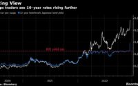
And here’s a chart showing Treasury market liquidity:

Chart Source: Bloomberg
In the intermediate term, it’s the lack of liquidity, rather than the high interest rates, that are the more acute problem for the Treasury market. The fact that large entities can’t buy or sell large amounts of Treasuries without moving the price, and the fact that there isn’t enough buyers to offset these structural sellers, is a growing problem.
In the long-term, as we look out a few years, the interest increasingly looks like a problem. Rising debt levels relative to GDP, large structural deficits year after year, and with flat-or-rising interest rates on those rising debts, will contribute to an inflationary fiscal spiral that will eventually require Federal Reserve intervention in order to monetize fiscal deficits despite above-target inflation.
Japan and significant portions of Europe are in a similar situation. Japan is the most advanced along this path, as it performs yield curve control to hold even long-term government bonds below the inflation rate.
The best protection against a fiscal spiral is uncertain, and thus requires diversification, but it likely involves owning a combination of cash-equivalents, gold, bitcoin, commodities and their producers, select emerging markets such as Brazil, and domestic value stocks (equities with reasonable valuations, positive free cash flows, and often good dividend payouts).
Portfolio Updates
I have several investment accounts, and I provide updates on my asset allocation and investment selections for some of the portfolios in each newsletter issue every six weeks.
These portfolios include the model portfolio account specifically for this newsletter and my relatively passive indexed retirement account. Members of my premium research service also have access to three additional model portfolios and my other holdings, with more frequent updates.
I use a free account at Personal Capital to easily keep track of all my accounts and monitor my net worth.
M1 Finance Newsletter Portfolio
I started this account in September 2018 with $10k of new capital, and I put new money in regularly. Currently I put in $1,000 per month.
It’s one of my smallest accounts, but the goal is for the portfolio to be accessible and to show newsletter readers my best representation of where I think value is in the market. It’s a low-turnover multi-asset globally diversified portfolio that focuses on liquid investments and is scalable to virtually any size.
I chose M1 Finance because their platform is commission-free and allows for a combo of ETF and individual stock selection with automatic and/or manual rebalancing. It makes for a great model portfolio with high flexibility, and it’s the investment platform I recommend to most people. (See my disclosure policy here regarding my affiliation with M1.)

And here’s the breakdown of the holdings in those slices:

Changes since the previous issue:
- Small individual equity changes, a bit more towards value stocks in general, the defense sector, and mid-sized banks.
Other Model Portfolios and Accounts
I have three other real-money model portfolios that I share within my premium research service, including:
- Fortress Income Portfolio
- ETF-Only Portfolio
- No Limits Portfolio
Plus I have larger personal accounts at Fidelity and Schwab, and I share those within the service as well.
Final Thoughts: The Economy in 2023
A fiscal spiral is worth understanding, and has both intermediate effects (Treasury market illiquidity) and long-term outcomes (significant amounts of money creation, a reduction in central bank independence, and structural inflation).
The topic also provides a historical backdrop for why backtests are unlikely to be very effective in this environment (unless they go back to the 1940s perhaps), and why analysts shouldn’t expect this business cycle and the next business cycle to play out like all recent business cycles in modern history.
However, that’s a very “big picture” macro view. In the nearer term, the more important question for asset prices is whether the US economy is headed towards recession in 2023 or not.
The yield curve, meaning the difference between the 10-year Treasury rate and the 3-month Treasury rate, suggests that we probably are. It has inverted prior to the past eight recessions, with no misses and no false signals. And it recently inverted again:

However, the copper-to-gold ratio has been rising lately, which tends to coincide with economic expansions. There is some current conflict between what the copper-to-gold ratio is telling us vs what the ISM purchasing manager’s index is telling us:

Could it be that, as the Federal Reserve stops raising interest rates, and the dollar index stops skyrocketing, and emerging market countries start to economically expand again, and China re-opens its economy from years of rolling lockdowns, that the rest of the world could pull us out of this economic slowdown?
That would be the “soft landing” scenario. It’s certainly possible, and indeed I view select foreign equities as being very cheap at this time and worth owning.
However, it’s important to be aware that monetary tightness takes quite a while to really impact the economy. Interest rates already skyrocketed from their ultra-low base, but the full effects of this are nowhere near in place yet. Most homeowners have fixed-rate mortgages, and those are unaffected. Only over time, quarter after quarter as people need to move, will this start to take its toll on the economy. New mortgage originations will be at these higher rates.
Similarly, average corporate debt has a substantial average duration. Quarter after quarter, more of it will become due and need to be refinanced at higher interest rates.
As consumers and corporations gradually refinance maturing debts into new debts with higher interest rates, it will translate into higher interest expenses, which means more income has to go towards servicing that debt and less income can go towards consumption and growth.
In other words, the fact that the Federal Reserve raised rates from zero to nearly 4% so far, has barely begun to take its toll on the economy. It has mainly taken its toll on jobs in the mortgage market and tech sector specifically, but the slowdown may expand from there.
So in summary, throughout 2023, this monetary tightening will begin to impact consumer and corporate refinancing, channeling income away from expenditure and towards the servicing of debt interest, which is likely to point towards recession unless or until the current policy regime changes.
Best regards,

[ad_2]
Source link

Debt-Limit Fight Undermines US Pitch of Stability to Allies Wary of China
Goldman Says BOJ Could Remove Negative Interest Rate Next