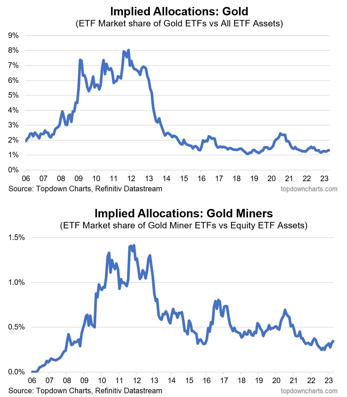
Chart of the Week – Gold (under)Allocations
Under-Allocated: With gold making yet another attempt at breaking out through that all-important US$2000 level, it’s worth reflecting on this pair of charts. Firstly, as discussed in the latest report, gold has been (and likely will continue to be) boosted by falling bond yields and a weaker US dollar. From a technical standpoint it has so far managed to hold onto the $2000 level, and has seen its 200-day moving average turn up with strong cross-currency breadth.
The macro and technical momentum is there, and positioning/flows/sentiment still has ample room to run on our metrics despite the recently renewed enthusiasm as gold has already rallied some 25% off the lows.
But it does beg the question as to whether new gold bulls have already missed the boat. And then you look at these two charts… investor implied allocations to gold (based on ETF market assets) remain well below long-term average, and well below the gold bull market years. It’s equally intriguing and informative for gold stocks — which are arguably also under-owned.
Remember, while most think gold is an inflation hedge, it’s actually going to be best placed in an environment of falling inflation …especially recession, because that’s going to be a scenario where monetary conditions ease (lower bond yields, pivot in Fed policy from tightening to easing, weaker USD), and gold gains.

Key Point: Despite a 25% rally, investors have light allocations to gold.
n.b. Check out the full archives of the Chart Of The Week for more charts.
Aside from the Chart Of The Week, this email gives you a brief overview of what was covered in the latest Weekly Insights report (which is a key part of our paid entry-level service on Substack).
Check out our paid service with a 7-day Free Trial
Aside from the chart above, we looked at several other charts and macro/asset allocation issues right now:
-
Gold Price: checking in on gold market technicals + outlook.
-
Gold Mining Stocks: (what does it mean for this sector)
-
Tech, Rates, FX: update on where things are sitting.
-
Backlogs, Bond Yields, Inventories: intriguing macro developments.
-
US Dollar Valuations: forget the narratives, focus on the charts & data.
-
US Small Caps: a look at the PE10 ratio for US small cap stocks.
-
Cross-Asset Valuation Snapshot: explaining the new dashboard.
Subscribe now to get instant access to the report so you can check out the details around these themes, as well as gaining access to the full archive of reports.
For more details on the service check out this recent post which highlights:
a. What you Get with the service;
b. the Performance of the service (results of ideas and TAA); and
c. What our Clients say about it.
Thanks for your interest. Feedback and thoughts welcome.
Sincerely,
Callum Thomas
Head of Research and Founder at Topdown Charts
Follow me on Twitter
Connect on LinkedIn
[ad_2]
Source link


