Will the Next Debt Ceiling Debate Conclude in Abolishment?

The Treasury has an open data platform where they publish all of the data related to the US Treasury. This includes debt, spending, revenue, etc. Different data sets are updated at different frequencies. The official US Debt is updated monthly (typically by the fourth business day). This data can be seen in the chart below.
The data is only updated through May 31st so does not reflect new debt issuance since the debt ceiling was suspended. As shown, the Treasury only added $7B in May. They exchanged Private Debt and Notes (2-10 years) for short-term and longer-term Public debt. Nothing major here, just the typical games the Treasury plays when subject to the debt limit.
Note: Non-Marketable consists almost entirely of debt the government owes to itself (e.g., debt owed to Social Security or public retirement)
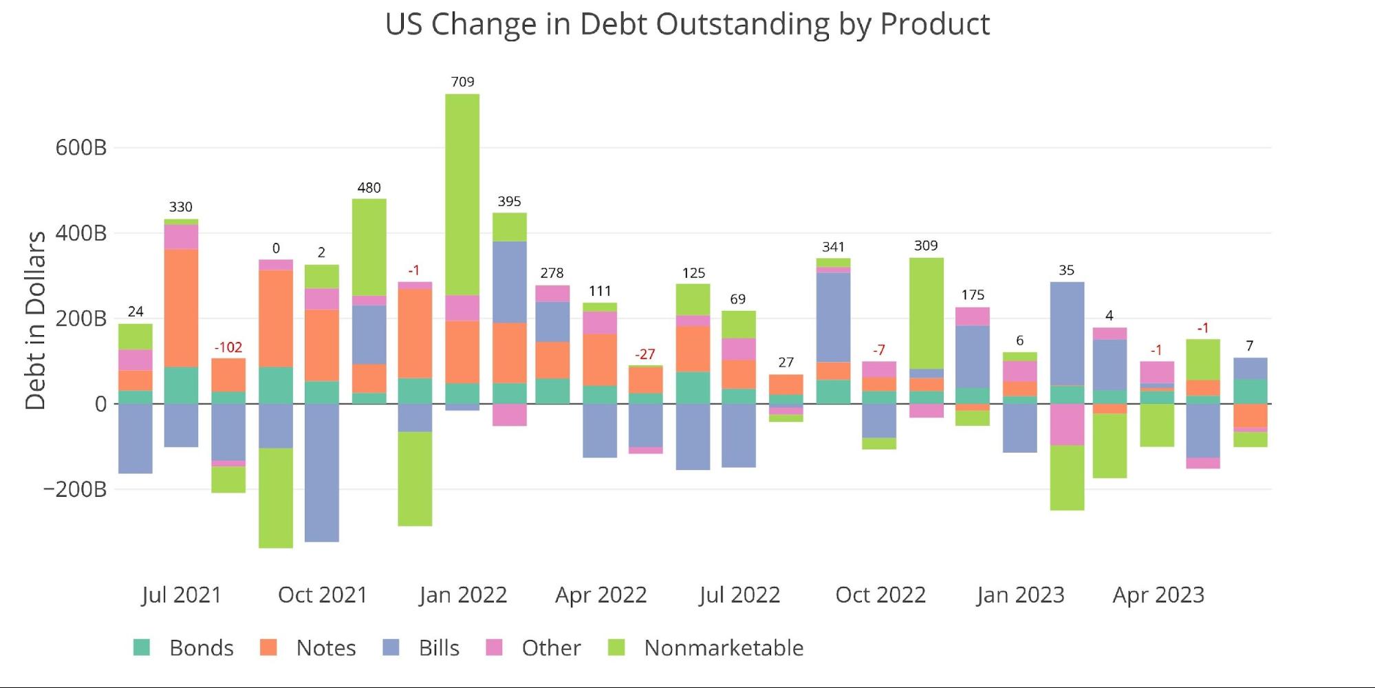
Figure: 1 Month Over Month change in Debt
Good news for the Treasury and bad news for pretty much everyone else, is that the debt ceiling was temporarily removed. This gives the Treasury carte blanche on new debt for the next two years. They wasted little time in utilizing their new no-limit credit card.
The chart below shows the week-over-week change in total US Debt. In the week ending June 10th, the Treasury increased total debt outstanding by a whopping $454B! This greatly exceeds any week during the Covid emergency and all the bailouts that ensued after. In fact, this was the second-largest week ever, coming in just shy of the all-time record of $456B set on November 7th, 2015.
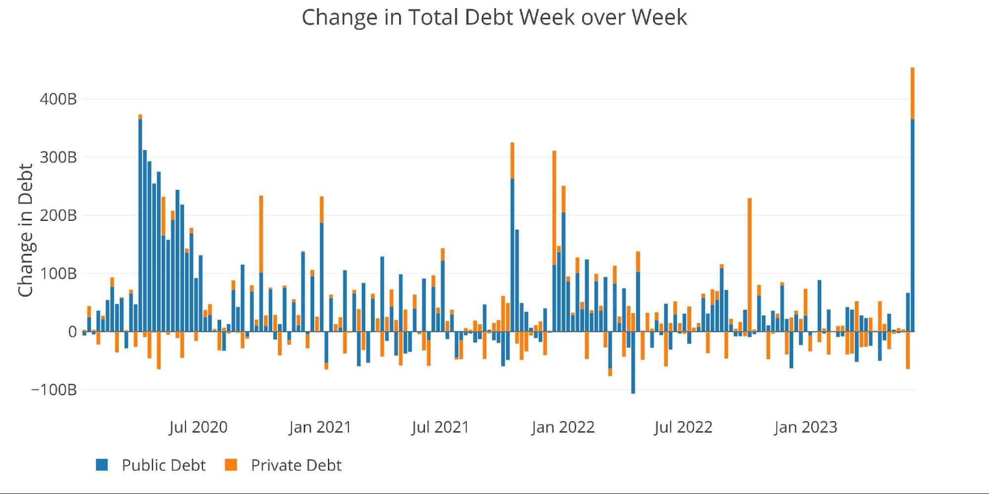
Figure: 2 Week Over Week change in Debt
The chart below shows the total debt outstanding. The current spike actually looks relatively tame compared to the recent history. The scary part though is that the spike represents one week. Market participants have been commenting for some time about how much new debt must be issued by the Treasury in the coming months. If this week is the start of a lot more debt issuance than the spike is only the start of a much bigger move.
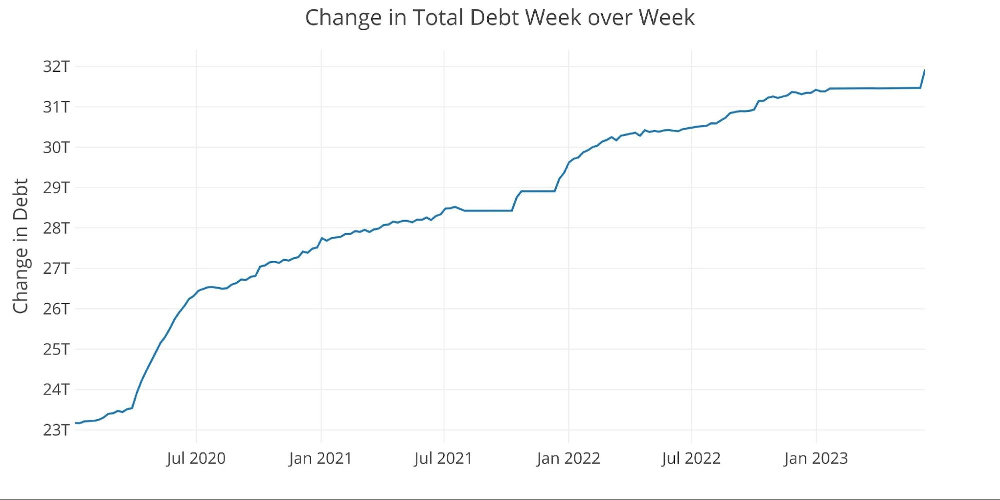
Figure: 3 Week Over Week change in Debt
The Treasury cash balance is one data point that demonstrates this is just the beginning. When the Treasury hit the debt limit, they relied on a healthy cash balance to fund the government. That cash balance got dangerously low in recent months.
One of Yellen’s main objectives in the coming weeks will be to reload the cash balance at the Treasury. The latest data shows that recent debt issuance made almost zero impact on the cash balance. This means new debt issuance is certainly coming to improve the cash position of the treasury (chart updated as of: June 8, 2023).
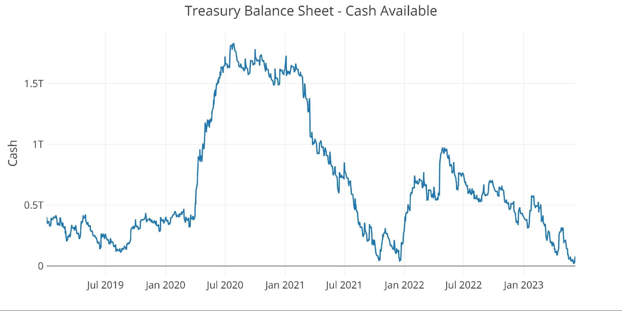
Figure: 4 Treasury Cash Balance
With plenty of forewarning, the market was able to take this issuance in stride. The chart below shows the bid-to-cover ratio of historical TBILL auctions. For months, the bid-to-cover had been hovering around the 2.5 rate. This shot up to 2.96 in the latest week which is the highest level since May 2022. It’s hard to believe this level of demand will stay in the market. As the chart below shows, it has been falling for years!
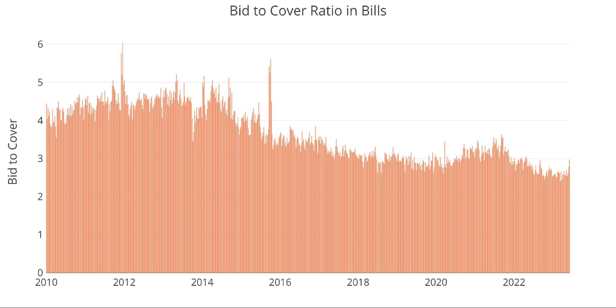
Figure: 5 TBILL Bid to Cover
The chart below shows the components of the bid-to-cover (Total Tender vs Total Accepted). As shown, the Total Tender surged to the highest amount since 2021. This helped to provide a strong auction but also looks more like an outlier rather than any change in trend.
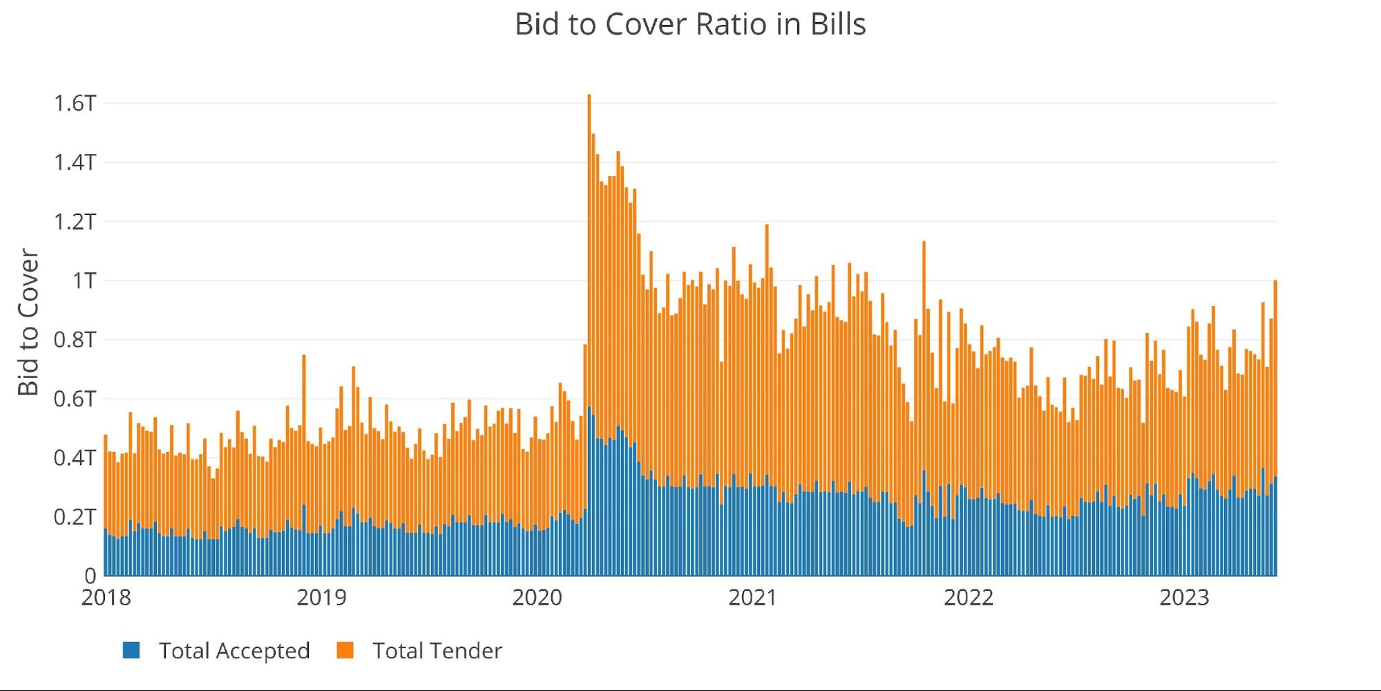
Figure: 6 TBILL Tender and Offer
We cannot wrap up without showing why so much debt will prove disastrous for the Treasury. Below shows the total annualized net interest on the debt. Total interest expense is rapidly approaching $600B!
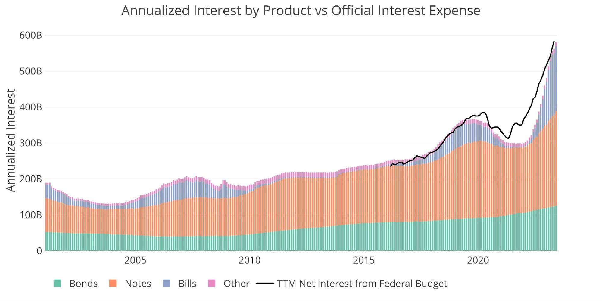
Figure: 7 Net Interest Expense
If you looked at the chart above and had a bad feeling about what the future holds, the chart below won’t put you at ease. It uses current debt rollover schedules combined with expected Fed interest rates to show what the future looks like. Total Net Interest Expense is set to exceed $900B by 2025. That is a massive expense, especially when you consider the government gains nothing from it. That is how the debt spiral really kicks into the next gear.
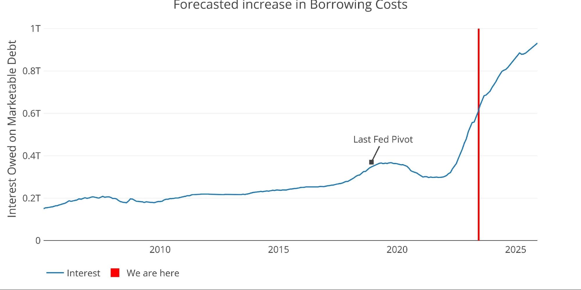
Figure: 8 Projected Net Interest Expense
Wrapping Up
The debt ceiling was raised (suspended), as almost everyone knew it would. One week in, the data shows that Uncle Sam has no hesitation in really enjoying the no-limit aspect of the current spending limit. Debt issuance is just getting started and will continue at heavy levels in perpetuity.
The next stop in debt issuance won’t come until after the next election. At that point, total debt could easily exceed $35T. The next dog and pony show will likely be under very different circumstances though. By suspending the limit for 2 years, the government has essentially bought itself enough time to see the next crisis get to full strength.
As the crisis unfolds, expect government spending to surge to new highs with the Fed stepping in to monetize trillions in new debt. The government will be adding trillions every few months which would make putting any limit on the debt nearly impossible. At that point, no one will be talking about fiscal responsibility, and it wouldn’t be a total surprise to see the debt ceiling finally abolished for good (a dream of many politicians). Prepare accordingly and load up on protective assets like gold and silver.
Data Source: https://www.treasurydirect.gov/govt/reports/pd/mspd/mspd.htm
Data Updated: Monthly on fourth business day
Last Updated: May 2023
US Debt interactive charts and graphs can always be found on the Exploring Finance dashboard: https://exploringfinance.shinyapps.io/USDebt/

Call 1-888-GOLD-160 and speak with a Precious Metals Specialist today!
[ad_2]
Source link

History says inflation could persist for a decade

Fed faces new inflection point amid troubling inflation data