The Fed Is Making Decisions on Poor, Untimely Data, Frequently Revised – MishTalk
Let’s start with a discussion of poor employment data, but the problems don’t stop there, or even in the US. Poor data is international.
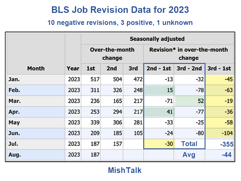
I got the above chart without the annotations from Michael Green, Chief Strategist Simplify Asset Management, a few days ago.
As you can see, the third revisions are negative for all of 2023.
I was interested in how this data looked over time so I created my own spreadsheets as follows.
Employment Revisions Thousands of Persons
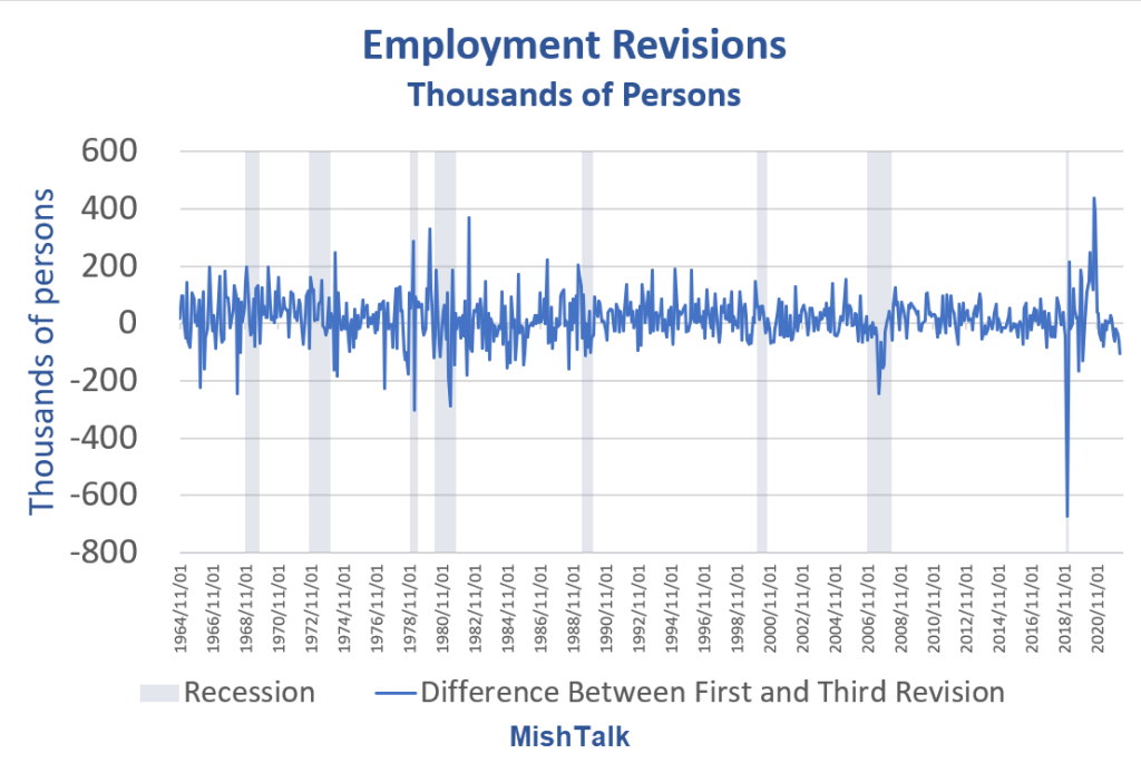
That looks like a random, unusable mess. However, revisions are clustered as a 6-month sum of revisions shows.
Employment Revisions Six Month Rolling Sum

Employment Revisions Six Month Rolling Sum Detail

The Fed is making decisions on baseline data that is increasingly unreliable with wild swings in revisions.
It’s much worse than it looks because the chart does not include annual revisions.
National Current Employment Statistics March 2023 Revisions

The BLS announced those revisions in the CES Preliminary Benchmark Announcement on August 23, 2023.
In accordance with usual practice, the Bureau of Labor Statistics (BLS) is announcing the preliminary estimate of the upcoming annual benchmark revision to the establishment survey employment series. The final benchmark revision will be issued in February 2024 with the publication of the January 2024 Employment Situation news release.
Each year, the Current Employment Statistics (CES) survey employment estimates are benchmarked to comprehensive counts of employment for the month of March. These counts are derived from state unemployment insurance (UI) tax records that nearly all employers are required to file. For National CES employment series, the annual benchmark revisions over the last 10 years have averaged plus or minus one-tenth of one percent of total nonfarm employment.
The preliminary estimate of the benchmark revision indicates a downward adjustment to March 2023 total nonfarm employment of −306,000 (−0.2 percent).
Revision Double Normal Size
This revision was double the normal size. But it will not reflect in the data until February 2024. Then what?
Let’s ponder the prior annual benchmark revision.
It was so huge I comment on it every month in my monthly jobs report.
Jobs Rise by 187,000 But 110,000 Negative Revisions and Unemployment Soars by 514,000

Payrolls vs Employment Gains Since May 2022
- Nonfarm Payrolls: 4,377,000
- Employment Level: +3,185,000
- Full Time Employment: +1,446,000
- Only 45.4 percent of the employment gains for the last 15 months was full time employment.
But who knows how accurate any of that is?
On September 1, I commented Jobs Rise by 187,000 But 110,000 Negative Revisions and Unemployment Soars by 514,000
Accounting for negative revisions, jobs effectively increased by 77,000 while unemployment surges as people looking for work can’t find it. Bloomberg labeled this “Goldilocks”.
Full time employment is down by 150,000 since January of 2023.
Here is a statement I have made in my jobs report every month since February.
Poof, Here You Go
Of the 894,000 rise in employment in January, 810,000 was due to annual benchmark revisions. And the BLS does not say what months were revised, just poof, here you go.
Again, we cannot, with strong confidence, suggest these reports portray an accurate picture of either jobs or employment.
The BLS does not say what months were revised. It just dumps huge revisions into the current bucket, without adjusting the prior data.
The annual revision for 2022 was a massive 810,000 but God only knows how.
I have been working on this idea for several days. The Wall Street Journal beat me to a similar headline today by hours.
Bad Data Everywhere, Not Just the US
Please consider the WSJ article The Problem With Economic Data Is Getting Worse emphasis mine.
Data revisions are occasionally so big that they upend our shared understanding of what’s going on.
The latest example comes from the U.K., where it turns out the economy grew much more than previously estimated. Rather than being the sick man of Europe with GDP still smaller than before the pandemic, and the weakest recovery in the Group of Seven industrialized nations, it has beaten Germany and grown in line with France (at least until their figures are revised).
The problem isn’t new, but it’s getting worse. Timely data is typically based on surveys, and even companies can’t be bothered to fill in surveys any more.
This isn’t only a problem for investors in the U.K., where the $3 trillion economy is almost 2% bigger than previously thought.
In the summer of 2011, the labor market appeared to have stalled. The Bureau of Labor Statistics reported zero job creation that August, and the Obama White House withdrew proposed new clean-air rules, citing the need to support the economy. The Wall Street Journal’s report on the figures was headlined “Job Growth Grinds to a Halt” and quoted an economist warning that “clearly, the economy is unwinding.” Stocks fell more than 2% on the day.
The timely data that drives markets on a day-to-day basis has become less reliable. The response rate for the survey of 651,000 businesses behind the payrolls data was steady at about 60% before the pandemic, but has since dropped to just 42%.
It’s even worse for the important Job Openings and Labor Turnover Survey used to work out how many vacancies there are and how many people are quitting their jobs. Investors have followed it fanatically over the past two years as a gauge of the labor market. The response rate has more than halved to just 32%.
WSJ Nonfarm Revision Chart
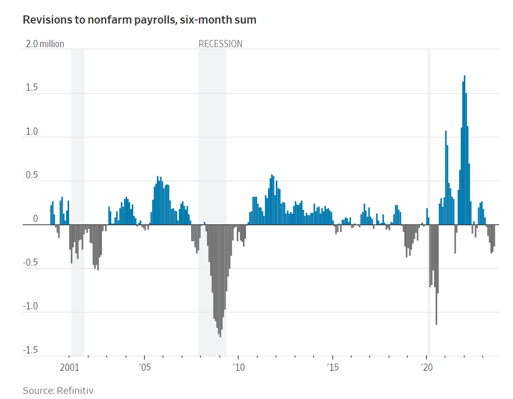
That chart matches the one I had been working on, shown above. I have detail dating back to 1964.
Let’s now discuss massive discrepancies in the data we do have.
Negative Revision to 2nd Quarter GDP, Huge Discrepancy with GDI Continues
On August 30, I commented Negative Revision to 2nd Quarter GDP, Huge Discrepancy with GDI Continues
GDP vs GDI Chart Notes
- Real means inflation adjusted
- GDP is Gross Domestic Product
- GDI is Gross Domestic Income
- Real Final Sales is the bottom line assessment of GDP. It excludes inventories which net to zero over time.
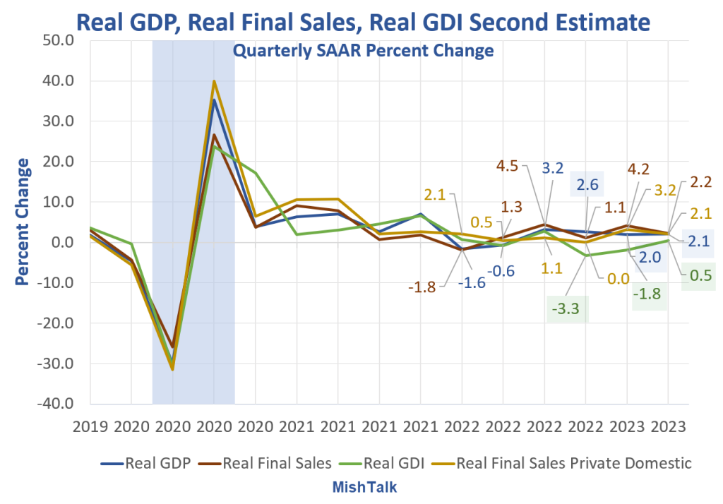
GDI was negative for two consecutive quarters and has been weaker than GDP for four quarters. GDI is now positive, but it is subject to greater revisions than GDP.
Two Measures of the Same Thing
Bear in mind that GDP and GDI are two measures of the same thing. Income should match products sold.
The last three quarters of GDP are +2.6%, +2.0%, and +2.1%.
The last three quarters of GDI are -3.3%, -1.8%, and +0.5%.
Philadelphia Fed GDPplus Measure Sure Looks Like Recession Started in 2022 Q4
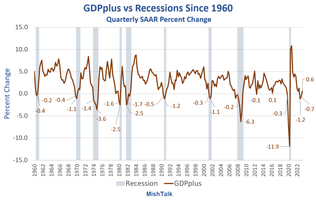
GDPplus is a measure of the quarter-over-quarter rate of growth of real output in continuously compounded annualized percentage points.
It’s a blend, but not an average, of Gross Domestic Product (GDP) and Gross Domestic Income (GDI). It is much smoother than either GDP or GDI as the above chart show.
In 100 percent of the cases, with no false signals, no misses, and no lead times more than two quarters, every time GDPplus had two consecutive quarters of negative growth, the economy was in recession.
And except for one negative print of a mere -0.1 percent, the economy was in or would soon go into recession as soon as the first negative GDPplus number surfaced, and stuck.
Of course, the fly in this ointment is revisions. The key words above are “and stuck.” But we have already gone through two revisions of GDI and thus GDPplus and those revisions were negative,
GDPplus Recession Signals

GDPplus Recession Signals Synopsis
- GDPplus signaled every recession
- GDPplus was on time 4 times, early by a quarter 3 times, and early by 2 quarters twice.
For discussion of the advantages of GDPplus, please see Philadelphia Fed GDPplus Measure Sure Looks Like Recession Started in 2022 Q4
People believe what they want and certainly Biden along with mainstream media is touting GDP.
But assuming we have enough negative revisions to employment under our economic belts, and those revisions are in the correct direction, the GDI/GDPplus version of the story is far more likely the accurate portrayal vs GDP.
Months or years after the facts are revised, if GDPplus is accurate, the NBER may determine the US went into recession in the second quarter of 2022.
And all that lording over the UK for Brexit by the “remoaners” now appears to be laughably false. Germany is worse off.
Central banks are making decisions off this terrible data.
[ad_2]
Source link
China pours money into Iraq as US retreats from Middle East – Business News Press
The US Military Is Training Third World Coup Leaders Again