My “Wealth Disparity Monitor” of the Fed’s Money Printer Era, September 2023: Now There’s Inflation, QT, and Rate Hikes
It’s just not the same anymore with QT and rate hikes. Household balance sheets by wealth category.
By Wolf Richter for WOLF STREET.
The Fed released its always shocking quarterly data on the distribution of wealth on Friday. It divides US households by category of wealth: The “Top 0.1%,” the “Remaining Top 1%,” the “Next 9%,” the “Next 40%, and the “Bottom 50%.”
What’s always shocking – though we’ve known it all along – is the huge wealth disparity between these groups of households, even between the “Top 0.1%” and the “Remaining 1%,” and even between the “Top 0.1%” and the “Next 9%.”
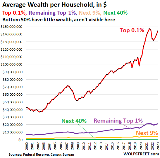
What’s shocking is the immense wealth disparity. the Top 0.1%, about 130,000 households, hold nearly 13% of the total wealth. The top 10% hold 56% of the total wealth. Their wealth compared to the rest of the Americans, and especially the bottom 50% forms the immense wealth disparity in the US.
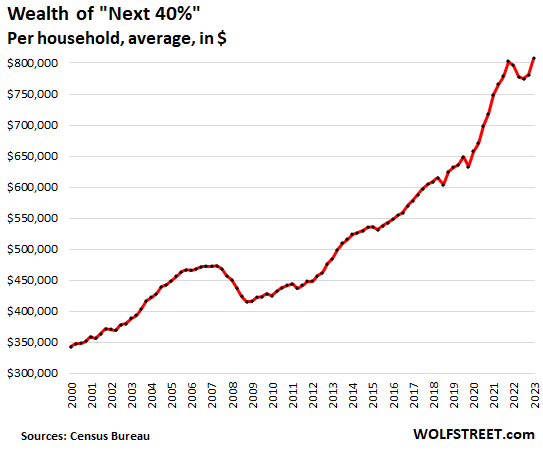
And yet, the majority of Americans have at least some wealth. The “Next 40%” of households – those between the top 10% and the bottom 50% — are doing quite well. Their net worth is on average $807,000. And even the upper portion of the bottom 50% have some wealth (assets minus debts), though it’s not much.
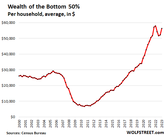
The Fed’s data doesn’t break down the bottom 50% further, but we know from other data that the bottom 20% are somewhere near or in poverty, while the upper portion of the bottom 50% are doing OK.
Wealth by wealth category, average wealth per household, in Q2, 2023 (wealth = assets minus debts):
- “Top “0.1%” (red): $144.1 million. Since Q4 2021, their wealth dropped by $3.1 million on average
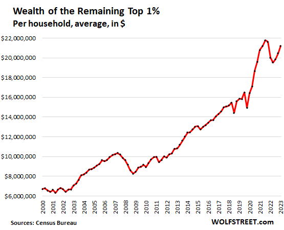
- “Remaining Top 1%” (purple): $21.2 million
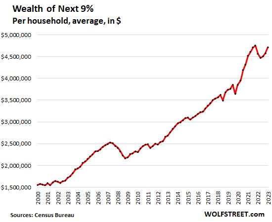
- The Next 9% (yellow): $4.7 million
- “Next 40%” (green): $807,000
- “Bottom 50%” (not visible in the chart): $56,000.
The top 50% (= 65 million households) are between fairly well off to immensely rich. The “middle class” might be the “Next 40%” plus the upper portion of the bottom 50%.
Wealth per household in each wealth category was obtained by dividing the Fed’s wealth category data by the Census Bureau’s number of households. So for example, the Next 40% are by definition 40% of households, or in Q2, nearly 52 million households.
Household balance sheets by wealth category, Q2 2023
Note: “Defined benefit” pensions are classic pensions where beneficiaries are promised a monthly pension for the rest of their lives. This includes classic corporate pension plans, teacher retirement plans, Social Security, etc. “Defined contribution” pensions are 401ks and similar plans.
| Bottom 50%, balance sheet, Q2 2023 $ | |
| Net worth | 56,295 |
| Total Assets | 151,267 |
| Real estate | 81,261 |
| Durables goods | 30,556 |
| Stocks, mutual funds | 3,528 |
| Defined Benefit pension | 5,061 |
| Defined Contribution Pension | 9,273 |
| Private businesses | 3,607 |
| Other assets | 17,983 |
| Total Liabilities | 94,972 |
| Home mortgages | 47,427 |
| Consumer credit | 42,823 |
| Other liabilities | 4,722 |
| Next 40%, balance sheet, Q2 2023, $ | |
| Net worth | 807,313 |
| Total Assets | 963,137 |
| Real estate | 375,920 |
| Durables goods | 63,153 |
| Stocks, mutual funds | 76,578 |
| Defined Benefit pension | 169,511 |
| Defined Contribution Pension | 96,017 |
| Private businesses | 35,912 |
| Other assets | 146,046 |
| Total Liabilities | 155,824 |
| Home mortgages | 114,404 |
| Consumer credit | 34,480 |
| Other liabilities | 6,940 |
| Next 9%, balance sheet, Q2 2023 $ | |
| Net worth | 4,711,287 |
| Total Assets | 5,038,016 |
| Real estate | 1,155,684 |
| Durables goods | 141,536 |
| Stocks, mutual funds | 1,154,434 |
| Defined Benefit pension | 772,783 |
| Defined Contribution Pension | 501,168 |
| Private businesses | 503,693 |
| Other assets | 808,718 |
| Total Liabilities | 326,729 |
| Home mortgages | 280,116 |
| Consumer credit | 28,421 |
| Other liabilities | 18,193 |
| Remaining Top 1%, balance sheet, Q2 2023 $ | |
| Net worth | 21,213,030 |
| Total Assets | 21,761,076 |
| Real estate | 3,843,064 |
| Durables goods | 404,068 |
| Stocks, mutual funds | 9,398,154 |
| Defined Benefit pension | 352,719 |
| Defined Contribution Pension | 686,185 |
| Private businesses | 2,957,698 |
| Other assets | 4,119,188 |
| Total Liabilities | 548,047 |
| Home mortgages | 426,281 |
| Consumer credit | 31,564 |
| Other liabilities | 90,202 |
| Top 0.1%, balance sheet, Q2 2023 $ | |
| Net worth | 144,091,336 |
| Total Assets | 145,236,769 |
| Real estate | 11,200,546 |
| Durables goods | 3,349,574 |
| Stocks, mutual funds | 65,392,845 |
| Defined Benefit pension | 293,812 |
| Defined Contribution Pension | 1,205,150 |
| Private businesses | 41,123,712 |
| Other assets | 22,671,130 |
| Total Liabilities | 1,145,441 |
| Home mortgages | 504,133 |
| Consumer credit | 170,541 |
| Other liabilities | 470,766 |
Primary beneficiaries of Easy Money: Biggest asset holders.
During QE and interest-rate repression, the already wealthiest people got immensely richer, as shown by the explosion of the wealth of the “Top 0.1%” (red line in the top chart) and of the “Remaining Top 1%” (purple line) through 2021.
The Fed has never made a secret out of its official policy, the “Wealth Effect.” Yellen published a paper about it in 2005 when she was head of the San Francisco Fed; Ben Bernanke published an editorial in the Washington Post in 2010, whacking dumfounded Americans over the head with his explanation of why the Fed was going for the wealth effect. The effect was supposed to be that this wealth somehow trickles down.
What we got instead of the wealth-trickledown is the worst inflation in forty years that followed the biggest wealth disparity ever.
I explained the Wealth Effect here, also citing the various references, including those from Yellen and Bernanke.
But the Fed has become quiet about the wealth effect recently. The failed policy has been replaced by a record amount of QT and rate hikes. It’s like “wealth effect” has suddenly become the dirty word that it has always been.
The Fed’s QT and higher interest rates have begun to reverse the wealth effect and have lowered the wealth disparity a little. The Top 0.1% have given up on average $3.1 million of their wealth since the peak in Q4 2021, despite the big gains in Q1 and Q2 this year.
In Q1 and Q2 this year, stocks have seen a historically huge bounce – and you can see in the charts above how part of the lost wealth was recovered. But Q3 is negative for stocks so far. The Fed will release the wealth data for Q3 in three months. The rapid wealth gains or losses at the top are largely due to changes in equity valuations.
Enjoy reading WOLF STREET and want to support it? You can donate. I appreciate it immensely. Click on the beer and iced-tea mug to find out how:

Would you like to be notified via email when WOLF STREET publishes a new article? Sign up here.
![]()
[ad_2]
Source link

Will The Fed Cause A Recession? What You Need To Know

54% of Americans are dipping into savings to pay for everyday expenses