Huge Moves in the Yield Curve This Year, What’s Going On? – MishTalk
The yield curve went from steeply inverted to nearly flat and is now becoming more steeply inverted.
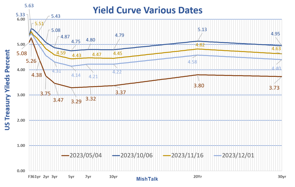
Chart Synopsis
- In May we had one of the most steeply inverted curves in history.
- In a devastating selloff in treasuries between May and October, the yield curve steepened to a much flatter state.
- The 5-year and 7-year treasury notes were most impacted, rising 1.46 percentage points and 1,48 percentage points respectively, in about 5 months.
- The inversion increased through November and on December 1, the curve is about half-way between the May state in early May and early October.
Notice point two, with apologies to Game of Trades on Twitter. He commented the yield curve was steepening and I said it was flattening. The curve did steepen, but the result was a much flatter state.
The Shape of the Curve

Inverted Double Humped
I created that chart a few weeks ago, adding the last two shapes, steep (positively sloped) and inverted humped. The first four shapes are from Financial Edge.
I created the inverted humped shape (more accurately double humped) by turning the humped state upside down, then applying a perspective warp change in Photoshop. Turning the chart upside down alone will put the hump in the wrong place.
Financial Edge describes the humped shape: “A humped yield curve, also known as a bell-shaped yield curve, is a rare type of yield curve that occurs when interest rates on medium-term fixed income securities are higher than the rates of both long and short-term instruments.”
Investopedia says “Although a humped yield curve is often an indicator of slowing economic growth, it should not be confused with an inverted yield curve. An inverted yield curve occurs when short-term rates are higher than long-term rates or, to put it another way, when long-term rates fall below short-term rates. An inverted yield curve indicates that investors expect the economy to slow or decline in the future, and this slower growth may lead to lower inflation and lower interest rates for all maturities.”
There is no discussion of the inverted humped shape anywhere that I can find, but that is the current state.
Weird or Something Else?
That looks weird because it is not the yield curve.
An accurate curve it needs to be to scale. On my chart, every vertical line is 3 months apart, with the Fed Funds Rate at point 0.
Even if we mentally smooth out the second hump (light blue dashed line), an inverted hump shape remains.
Smoothed Chart Removing Second Hump
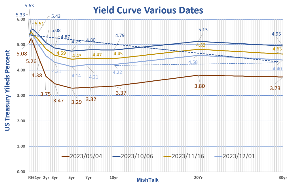
The darker dashed blue line shows we are not dealing with a normal inversion. Starting at 5 years the curve steepens.
I suspect illiquidity of the 20-year bond explains the nature of the curve between 10 years and 30 years. So, mentally smooth it out with that as I did above.
What about the rest of the curve?
Three Possible Explanations
- Regarding the huge inversion between 1 month and five years, then strongly steepening: Could it be the bond market smells a short quick recession followed by a big inflation problem coming down the pike?
- Risk aversion: Risk aversion is another possibility. Investors are happy with shorter term bonds and demand increasing more out of justifiable fear of what might happen.
- What about the fed? Does the market finally understand the Fed is no longer in control?
The Decline in Inflation is Transitory
The short explanation is the bond market believes the current year-over-year decline in inflation is temporary or at least has a fear that it might be.
Also, the Fed never was in control, but tail winds of global wage arbitrage, just-in-time manufacturing, and outsourcing made it appear the Fed was in control. Long-term doubts may be surfacing.
No One Will Fix This
On September 7 I offered this view: Debt to GDP Alarm Bells Ring, Neither Party Will Solve This
“Neither party will fix the deficits. Neither party will do anything about mounting debt. No one will do anything about anything because the political system is totally broken.” Mish
But when do the deficits and debts matter?
That was the focus of a follow-up post on December 3,
When Does US Federal Debt Reach an Unsustainable Level?
Please consider When Does US Federal Debt Reach an Unsustainable Level?
A possible message of the Treasury market and gold is that neither believes the Fed is in control or won’t be starting five years from now.
Bitcoin advocates would say Bitcoin is sending the same message.
Please see the above links for discussion. Then if you have any other explanations for the double humped inverted curve, please comment.
[ad_2]
Source link
Slowing! Jobs Friday Shows Decline In Jobs Added, Real Avg Hourly Earnings Growth Now -3.25% YoY (NOT The Strongest Economy In History!) – Confounded Interest – Anthony B. Sanders

US Extends 101st Airborne Deployment in Southeastern Romania